We've been living in our new construction home for a couple of weeks now and I'm so excited to give you a tour of the kids' bathroom and laundry room—it's a 2-for-1 today! These rooms are right next door to each other and I designed them to complement each other, so it felt right to share them in one bumper reveal post.
Most of the house is still full of boxes and we have a long list of projects plus furniture to buy that will keep us busy for...years, probably? But all these two rooms needed were a thorough clean and a few finishing touches. It feels good to have at least one small part of the house put together!
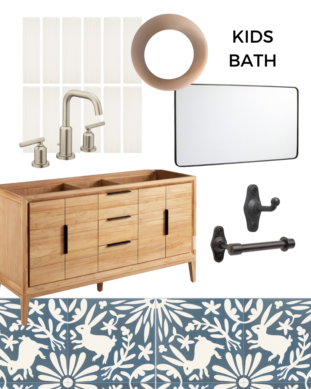
Let's start with the kids' bathroom. Here's where I started out with the design plan:
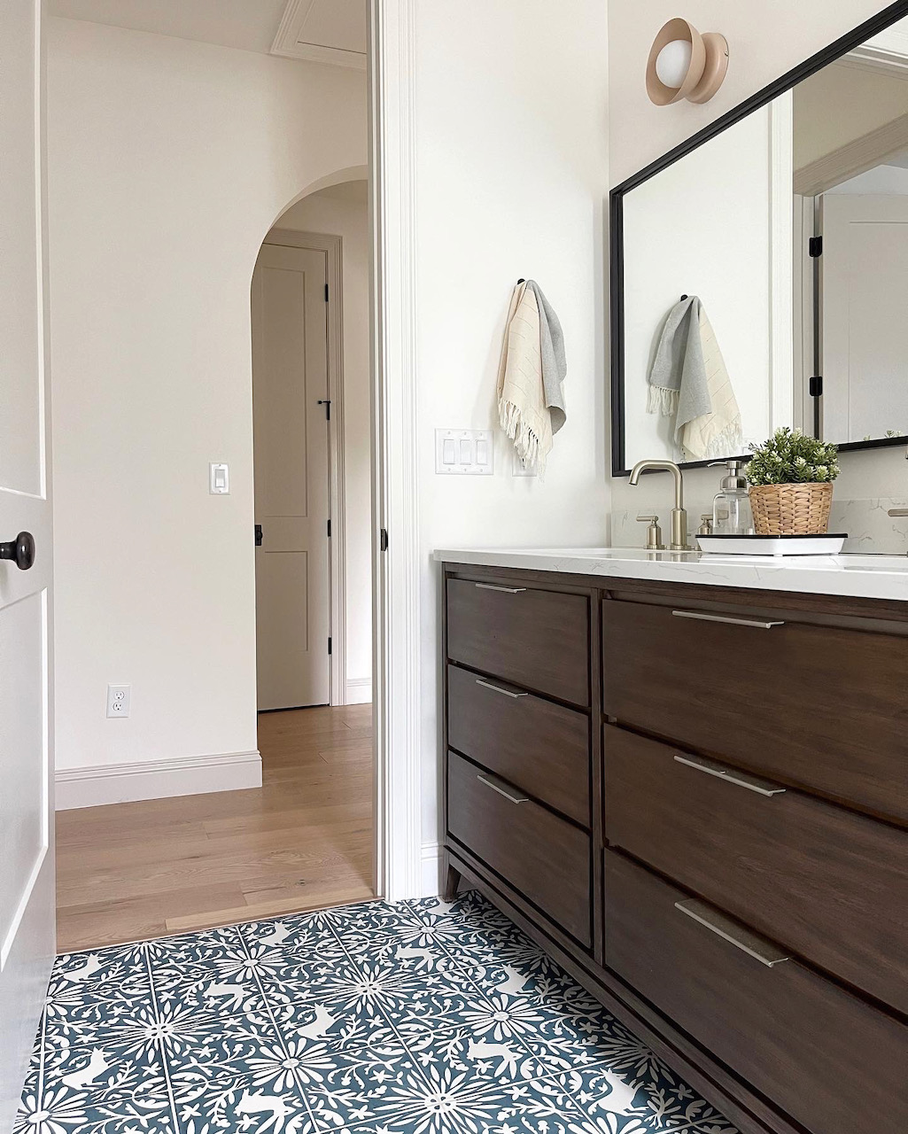
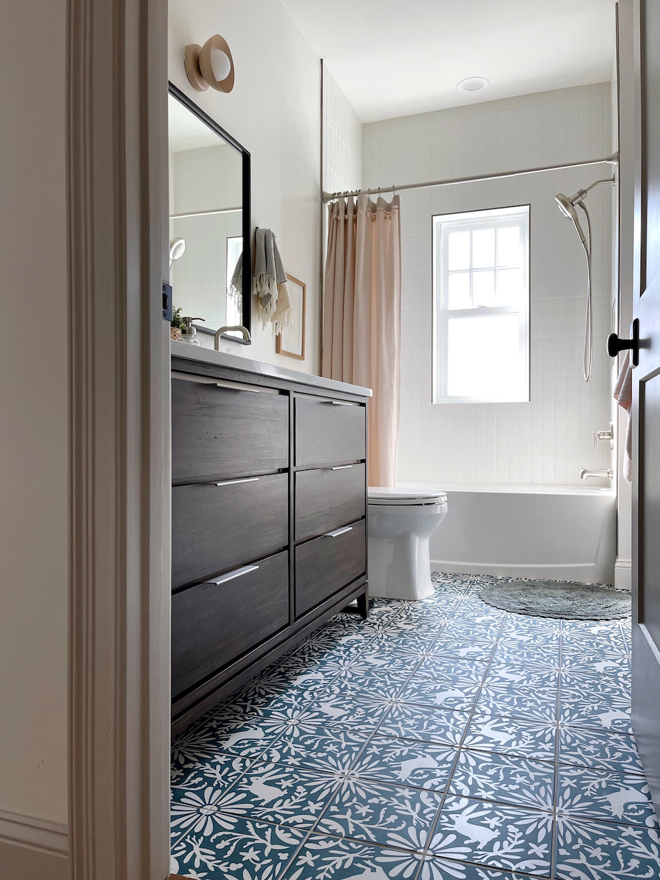
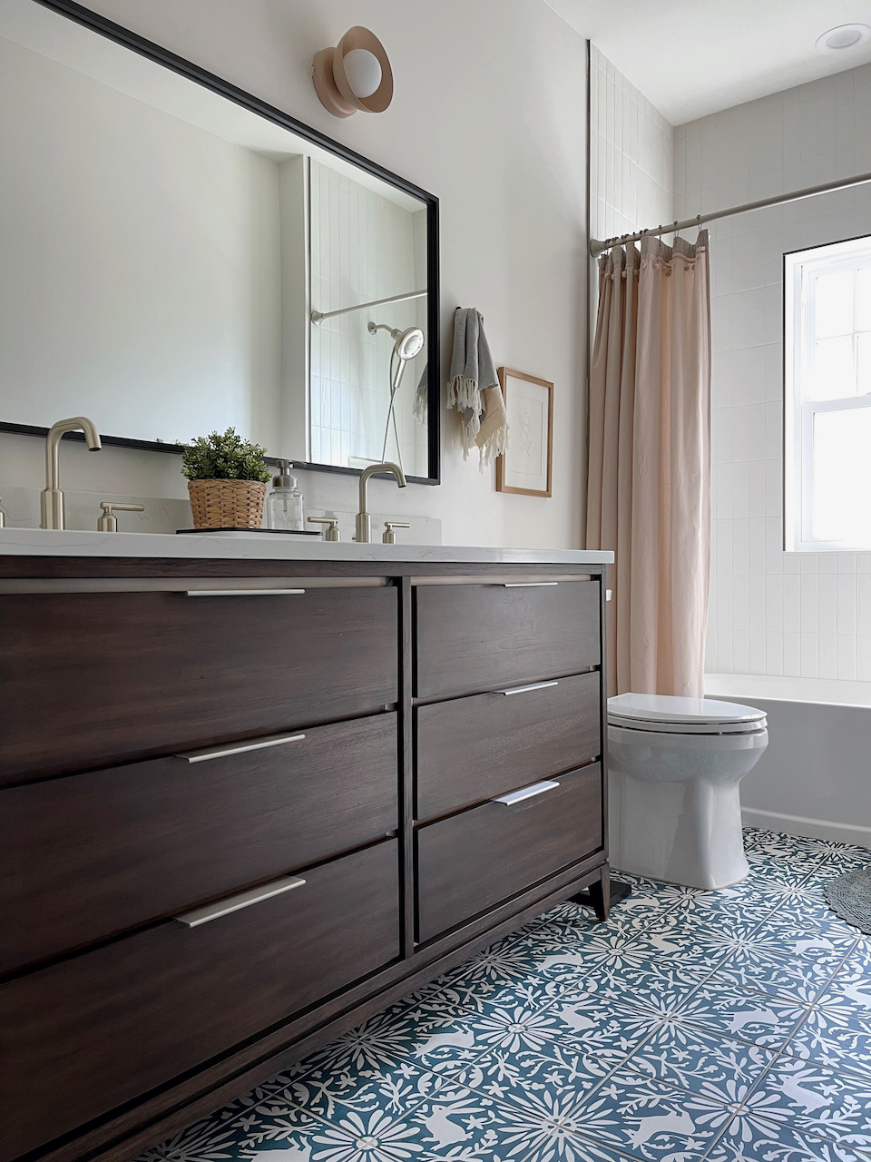
And here's how the bathroom turned out!
ANY CHANGES FROM THE DESIGN PLAN?
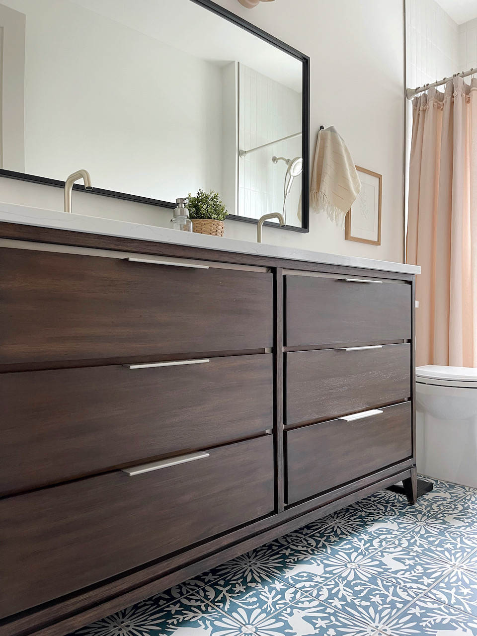
Aside from the choice of vanity and mirror, we stuck pretty closely to the original mood board. The bathroom vanity I had originally picked out wasn't available in the timeframe I needed it, so I ended up choosing the Hytes mahogany double vanity. I have to say I LOVE the richness of the darker wood with the blue tile, and I'm glad my first choice wasn't available! It's solid wood and HEAVY so I think it will hold up well over time. I opted for a slightly wider mirror which matches the width of the vanity exactly.
THE KEY PLAYERS
The whole room design started with the Jardín de Luna Rabbit tile from Clay Imports. We used three mix-and-match tile designs and had fun laying out all the different pattern options before we landed on this combination:
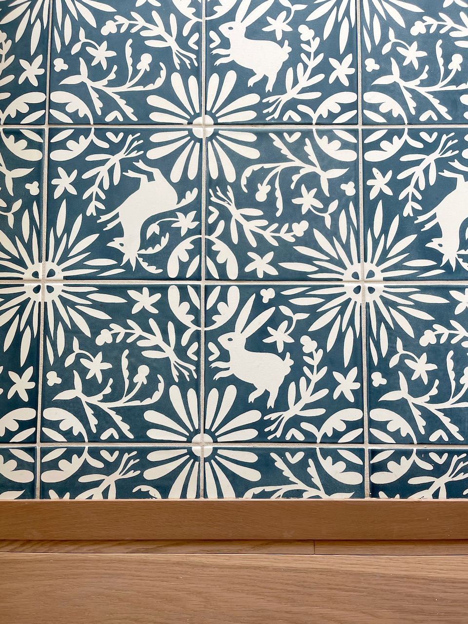
Aside from the whimsical design, I also chose this tile because it is extremely low maintenance. It is glazed, which means no sealing is needed at all...ever! And it's so easy to clean—ideal for a kid's bathroom. I'm pretty smitten with this tile and I would choose it a thousand times over!
ANYTHING I WOULD HAVE DONE DIFFERENTLY?
The only thing I would change in here is the bathtub. I just went with whatever the plumber picked out (still not quite sure how I let that slip through...) and I would have preferred something with cleaner lines. Thankfully it's a minor thing and there's absolutely no chance of us replacing the tub unless something catastrophic happens, so I will try and learn to like it!
ON THE TO-DO LIST
I originally thought about adding a gallery wall in here but I'm not sure it's needed. The room feels balanced as-is, and I'm not sure I want to anything else since it's quite a small space. So, I'll tentatively say that this room is complete.
SOURCES
Wall and trim color: SW White Flour
Vanity: 60" Hytes Mahogany Double Vanity (quartz top is "feathered white")
Floor tile: Clay Imports Jardín de Luna RABBIT | DEER | HERB
Shower wall tile
Sconce lights
Double mirror
Faucets
Handheld showerhead
Robe hooks
Towels
Bathmat
Shower curtain: (no longer available—similar)
Vanity tray
Door hardware
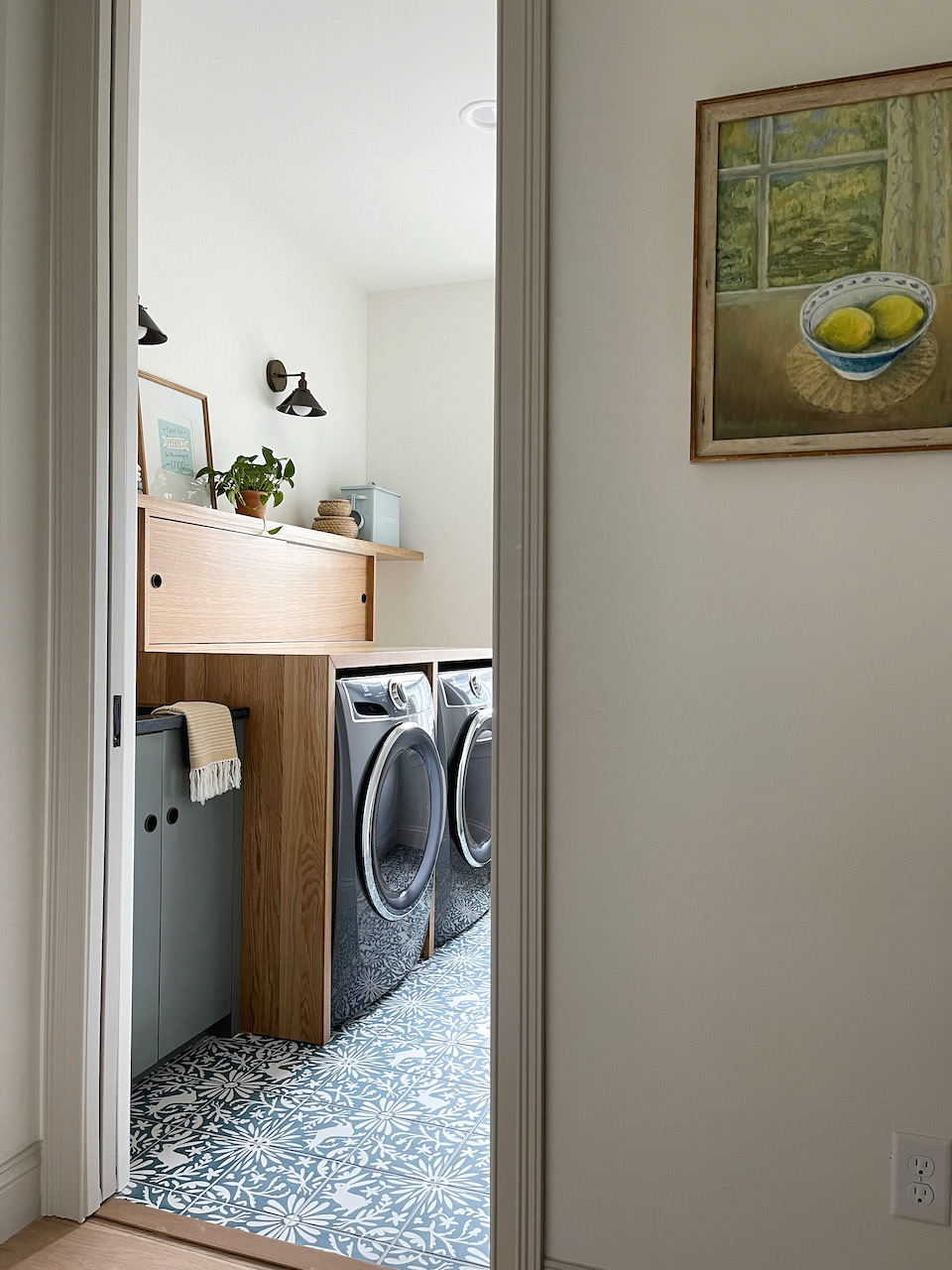
Our laundry room is located right next door, and because of this view as you walk up the stairs, I wanted to make the rooms feel like they belonged together:
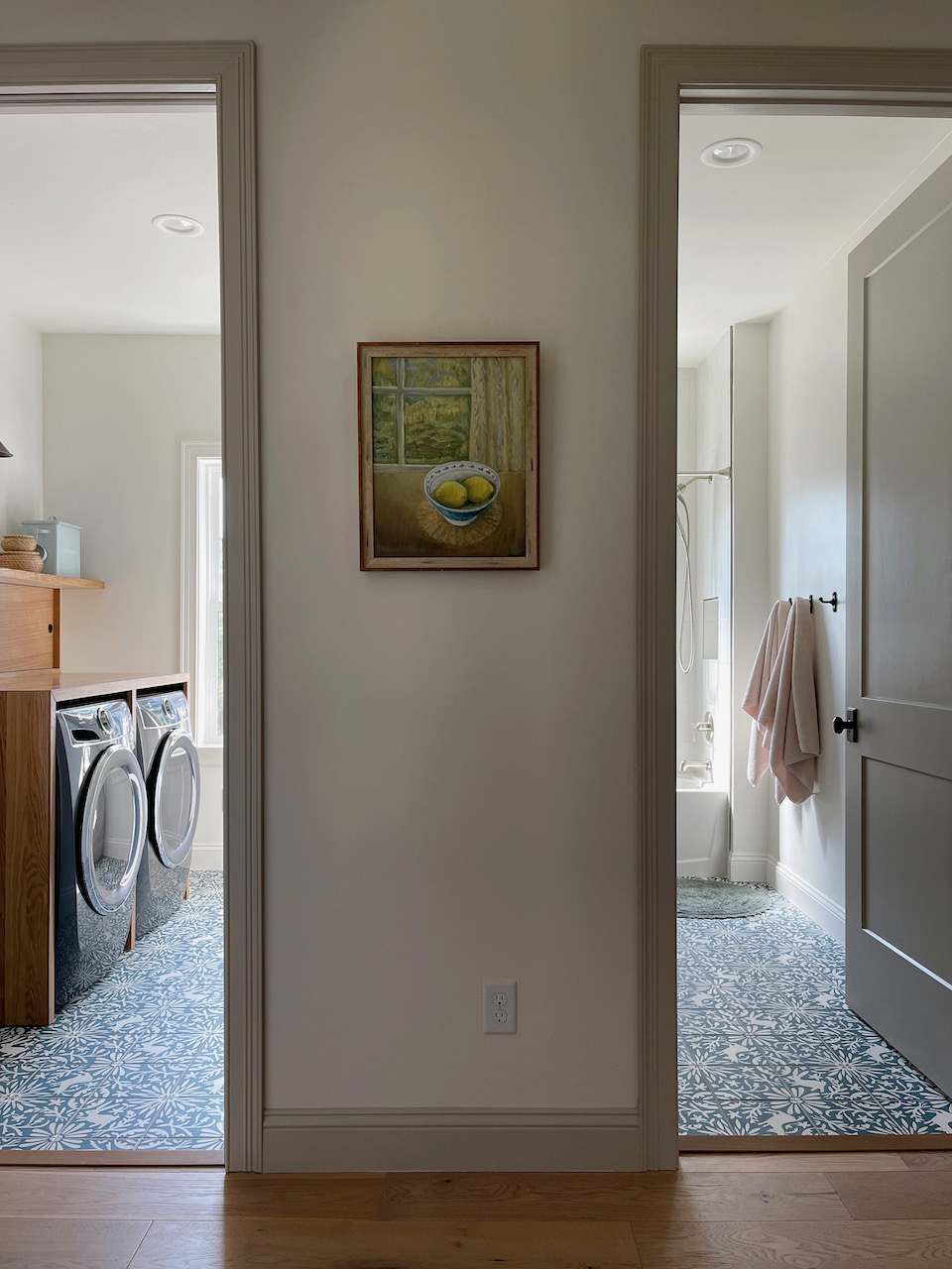
We used the Jardín de Luna tile tile in both rooms, and I love the cohesive look it has created. I also used a similar color palette in both rooms—blues, pinks and greens.
THE KEY PLAYERS
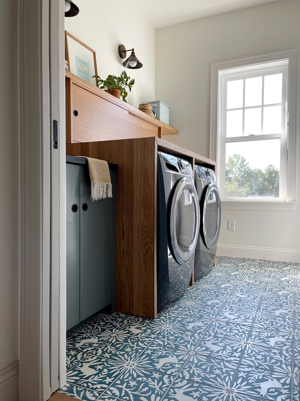
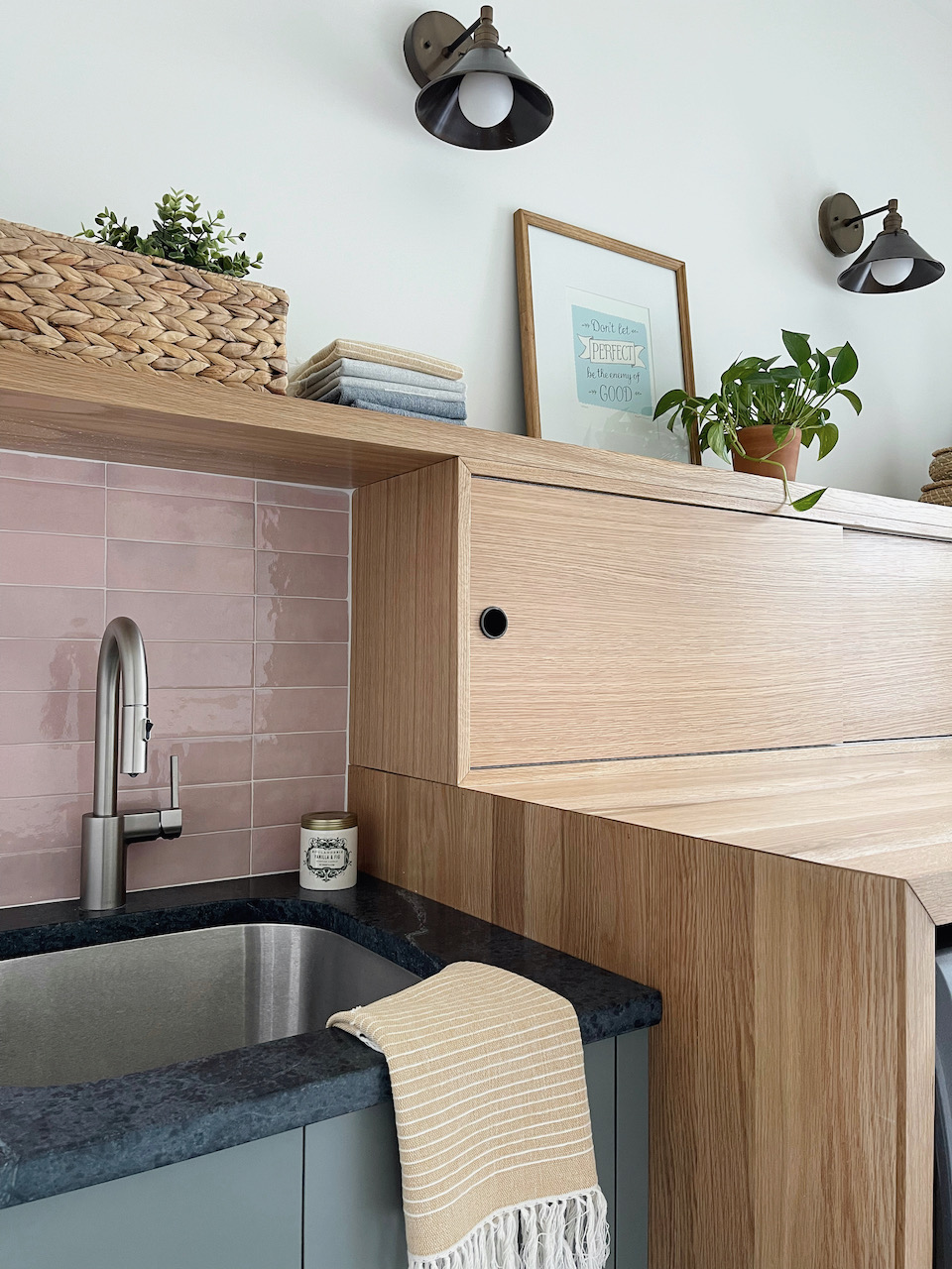
I spent a lot of time in the design stage working out the layout of the custom cabinetry, and it went through a lot of different phases. I absolutely love where it landed, and it provides us all with the hidden storage we need plus adds a lot of personality and style to a primarily functional space.
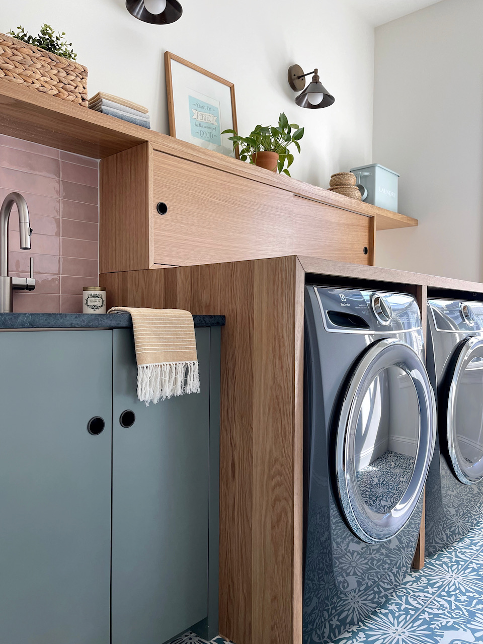
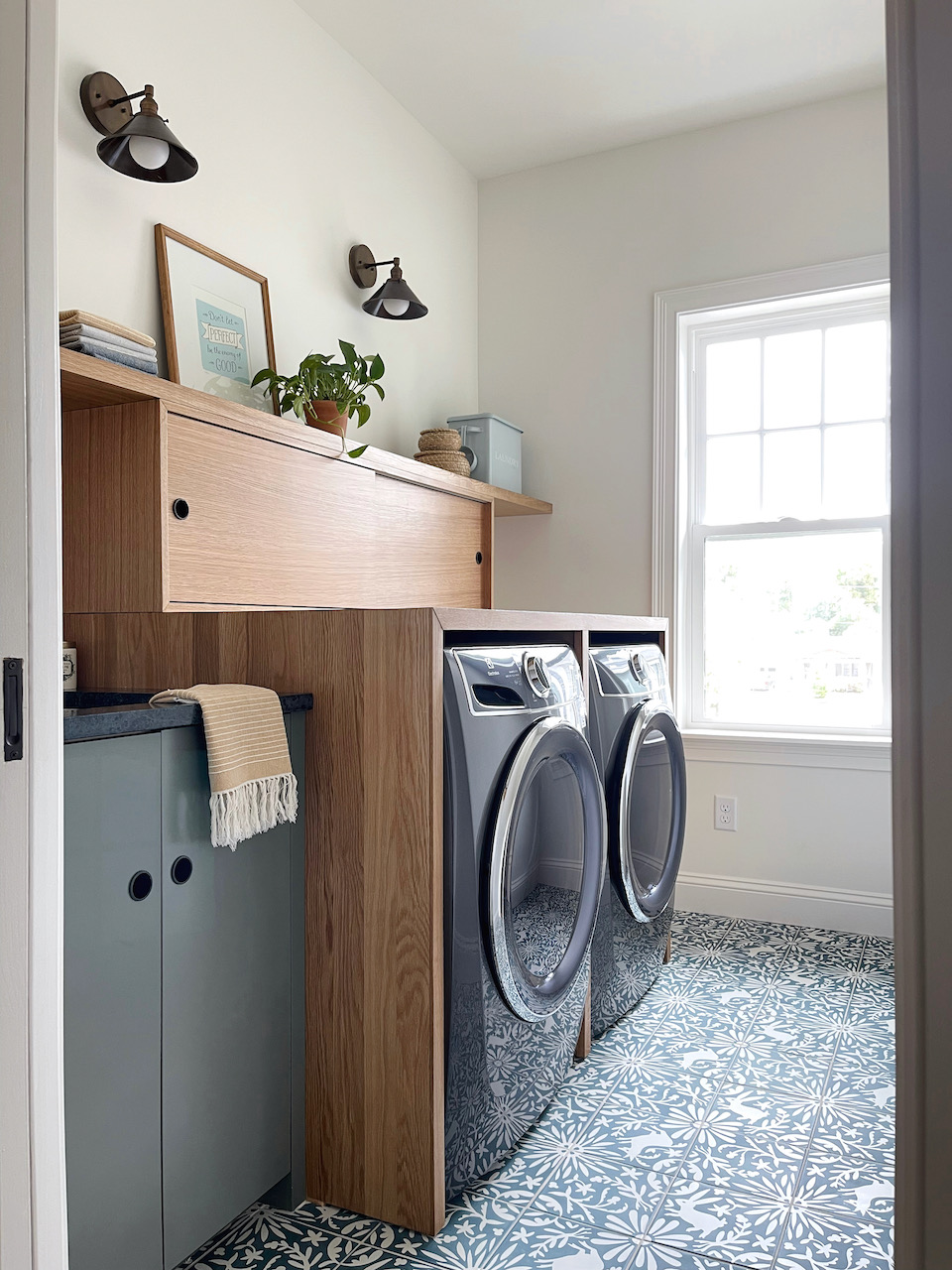
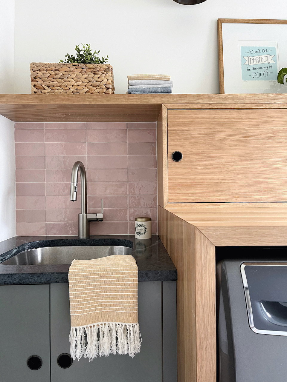
We used a local design company (Brooklyn Roots in Jacksonville) and they took my initial sketch and turned it into something pretty special. I wanted mostly wood tones to keep it neutral, but for the sink cabinet we added a splash of color with the green lacquered finish.
ANYTHING I WOULD HAVE DONE DIFFERENTLY?
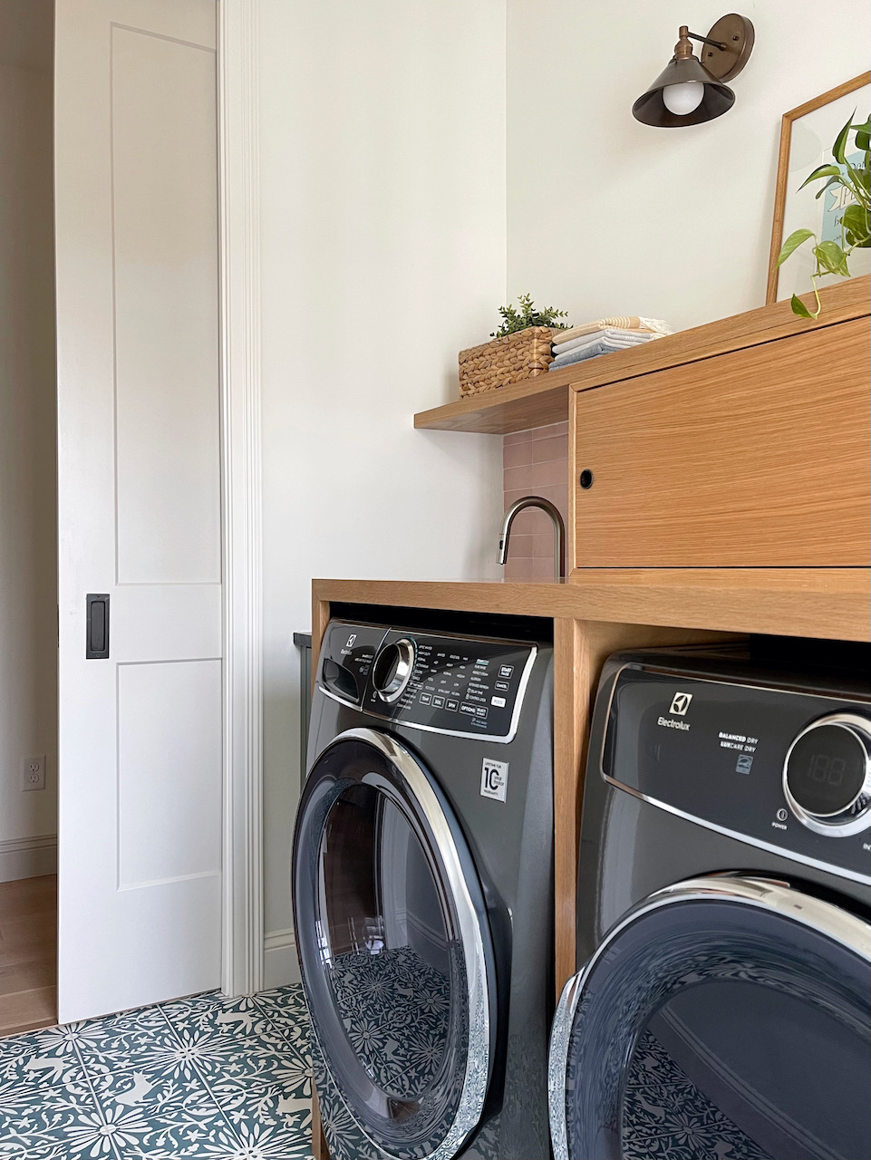
We had to design the cabinetry around the placement of the window, which means that we have a small gap where a rod for hanging clothes is going to be installed. I am happy with the way it's worked out, but I think it might have been easier to plan the layout of the room if we had foreseen the awkward window placement when we were drawing up plans. This is also the reason we installed a pocket door instead of a regular door, as the door swing would have hit the washer. Overall this room has been a bit of a puzzle to figure out, but I'm definitely pleased with the outcome.
ON THE TO-DO LIST
I styled the shelves with what I could find at the top of our boxes (we haven't finished unpacking yet!) so I will most likely revisit that at some point. I think this could be a really fun room to add a gallery wall, perhaps above the shelf on the back wall. I'll be keeping my eyes peeled for unique pieces to collect.
SOURCES
Wall and trim color: SW White Flour
Hallway trim color: SW Modern Gray
Sink cabinet color: SW Pewter Green
Floor tile: Clay Imports Jardín de Luna RABBIT | DEER | HERB
Backsplash tile
Faucet
Sconce lights
Pocket door pulls
