Well, it might have taken a while but our kitchen is now completely finished and I'd say it was definitely worth the wait! The neverending appliance delays definitely tested our patience but we will never take them for granted again. Let me tell you, dishwashers are a MAGICAL GIFT.
In order to get our final inspection passed we installed a temporary cooktop that I managed to find at a discount warehouse and later sold on Facebook Marketplace. Our fridge miraculously arrived the week before we were due to move in, but we were still missing an oven, a dishwasher and a downdraft vent so we did a lot of grilling and a lot of dishes for the first few months of living here.
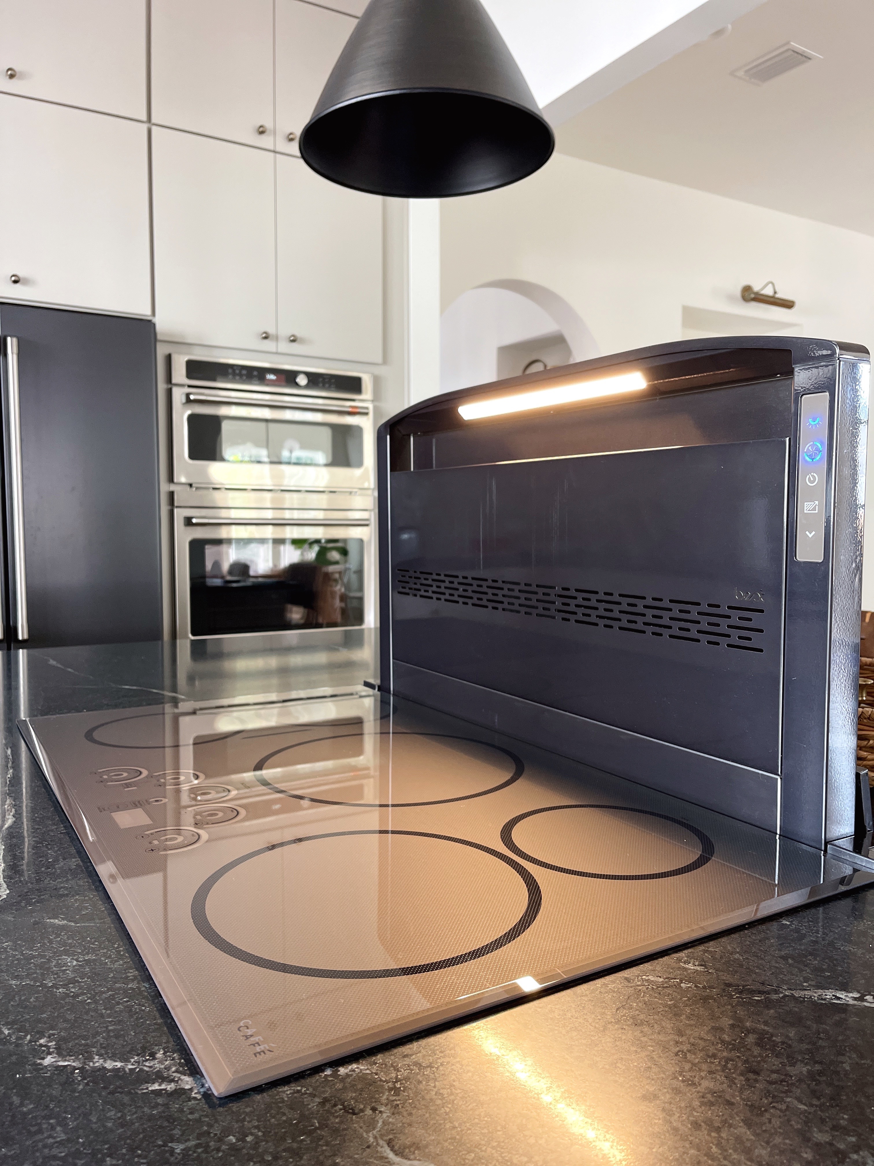
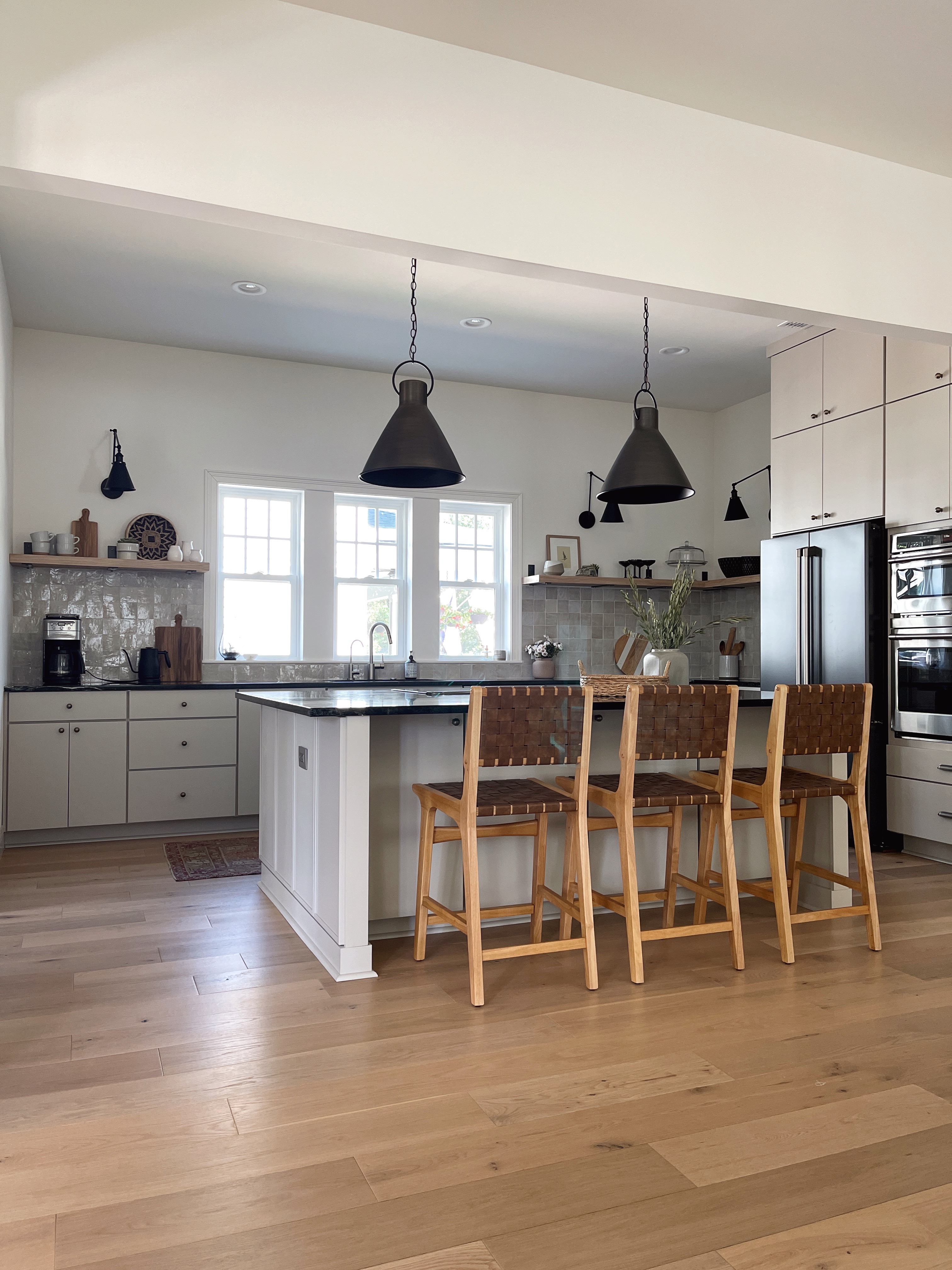
While I'm on the subject of appliances—we are SO glad we chose an induction cooktop. At the time we weren't sure it was worth the upgrade but it's such a breeze to clean. I also love our fridge choice with the internal water dispenser (no drips on the fridge doors!) and the matte black finish is gorgeous. Our wall oven was only available in a stainless finish but I actually prefer the contrasting finishes since the two appliances are side by side.
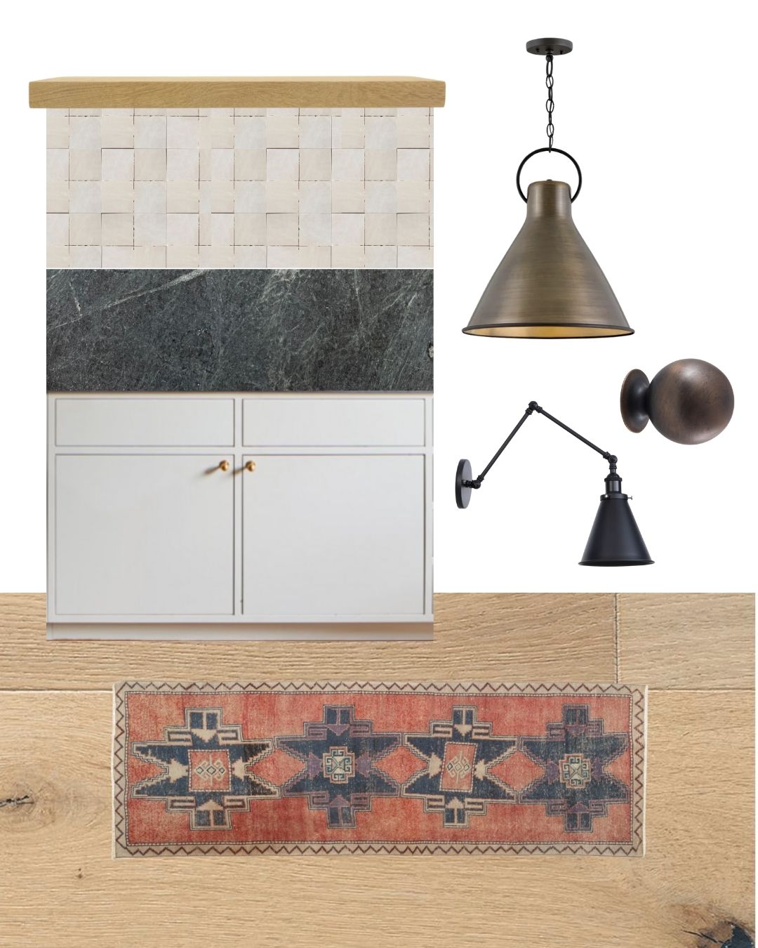
Here's the design plan I landed on (after much back and forth over some of the details...)
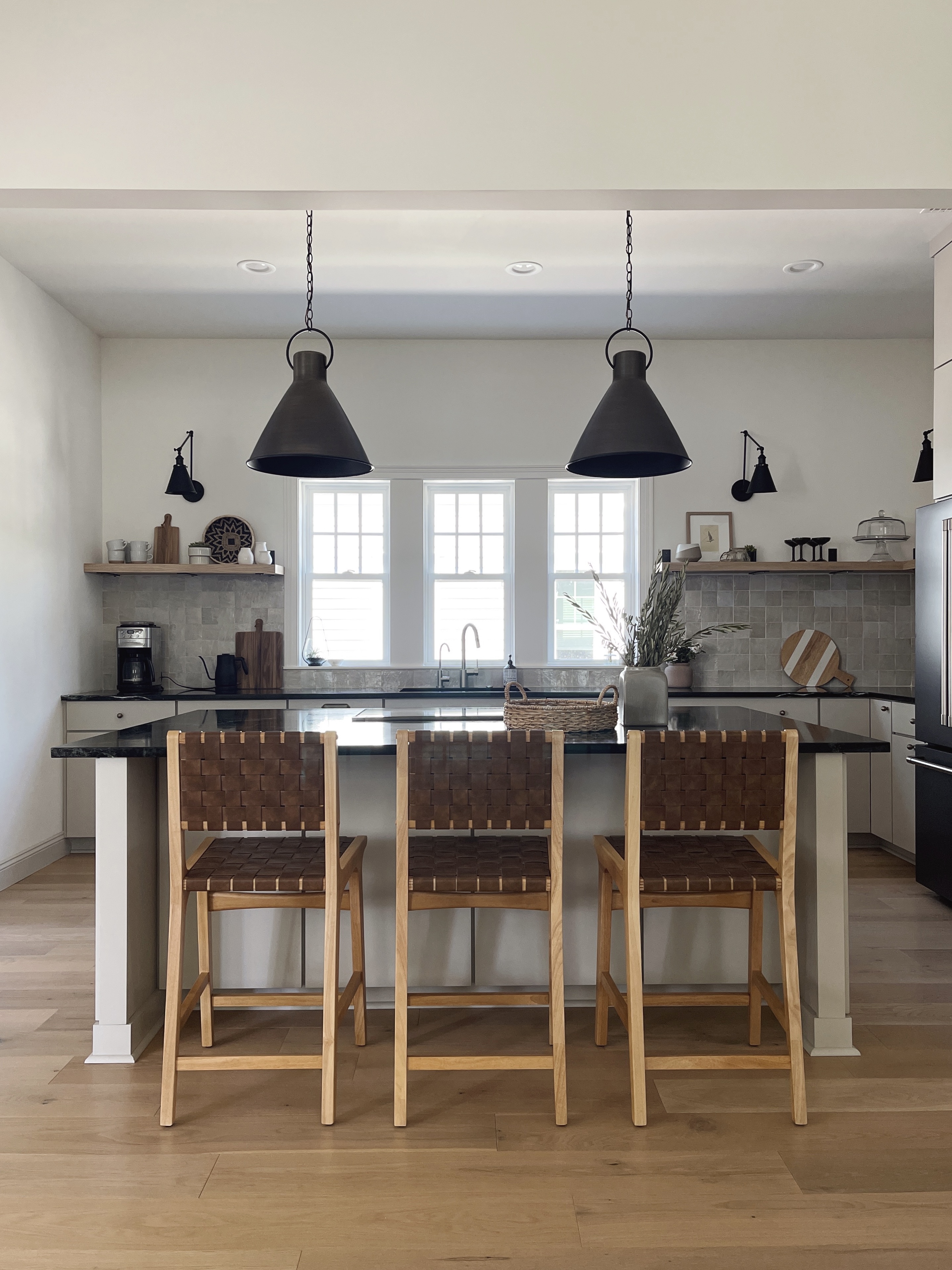
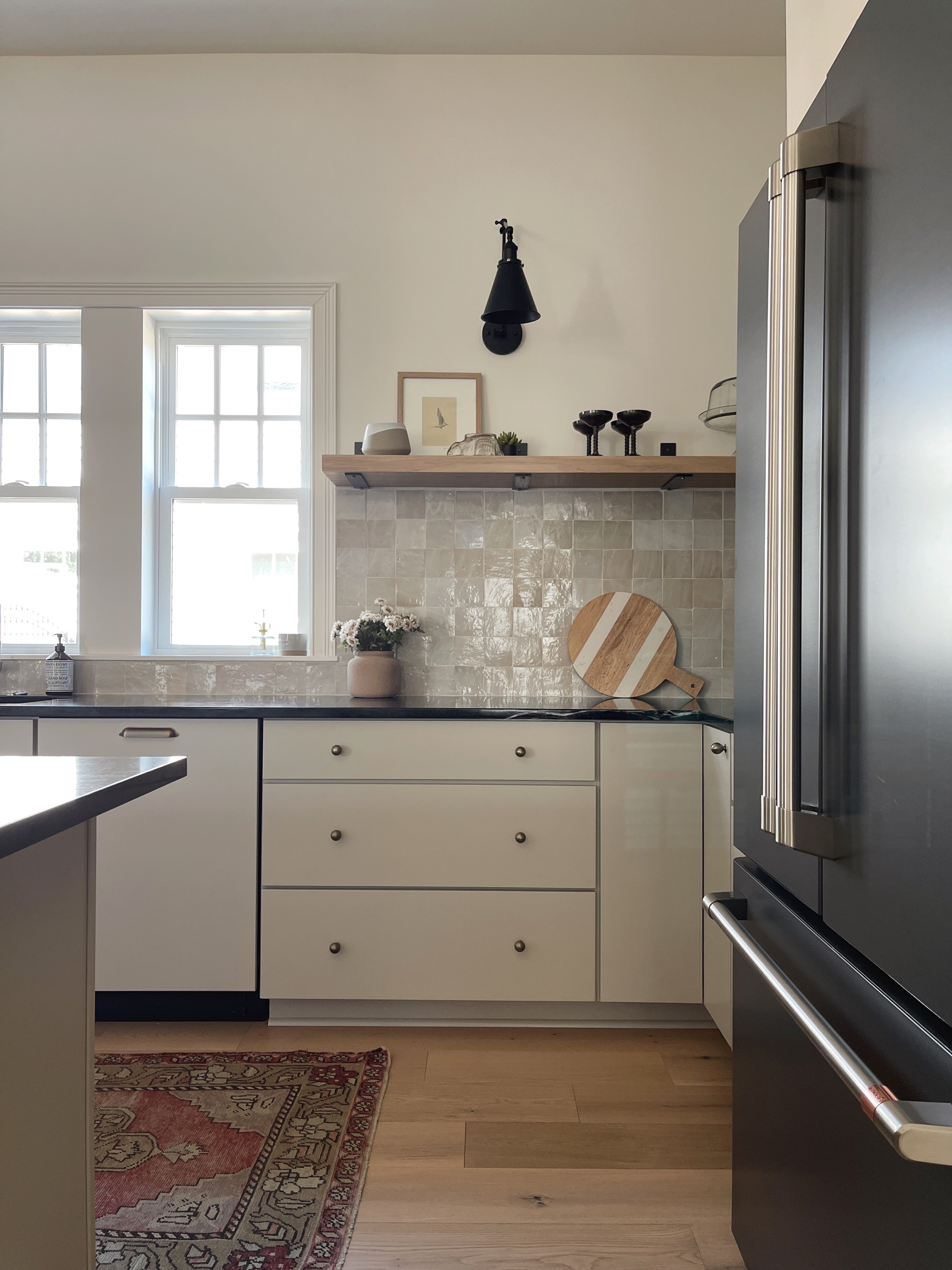
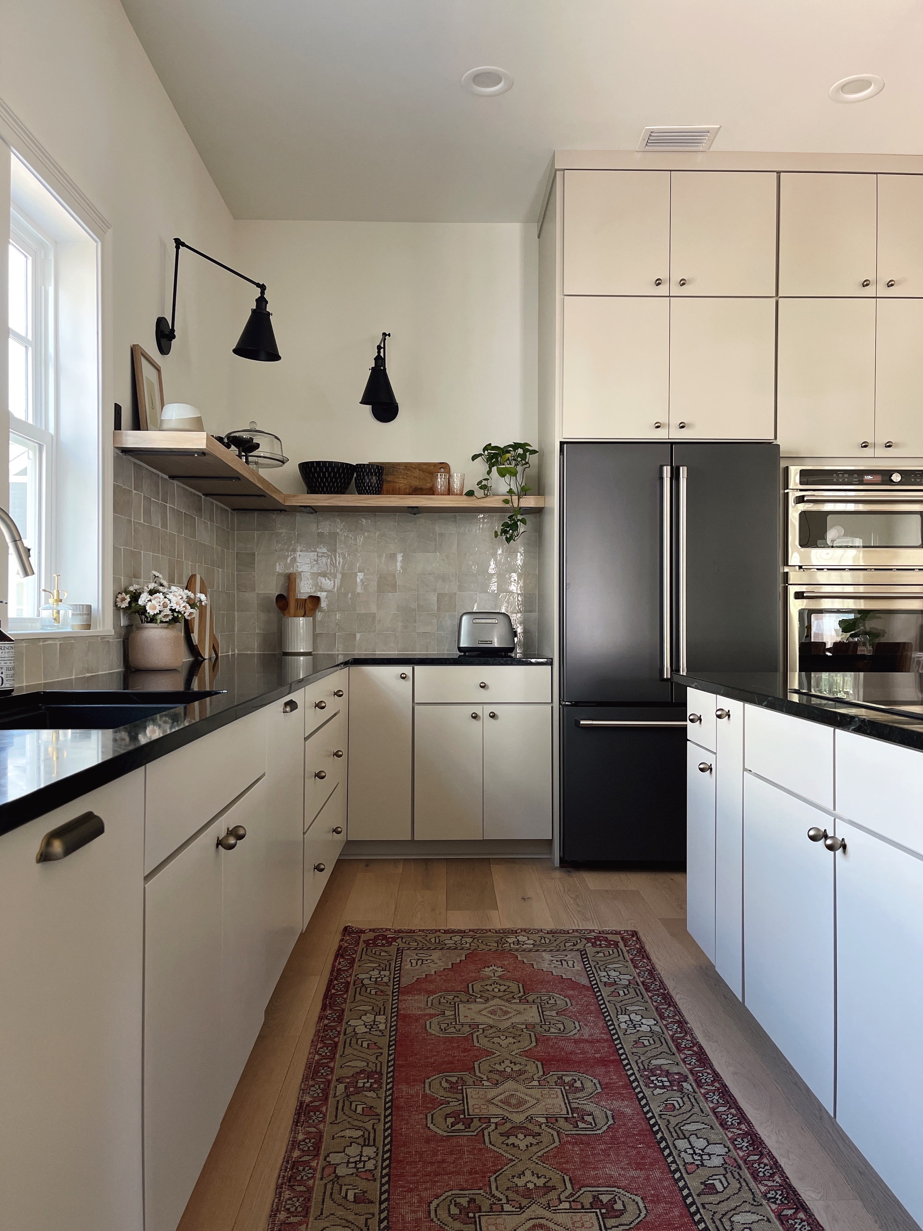
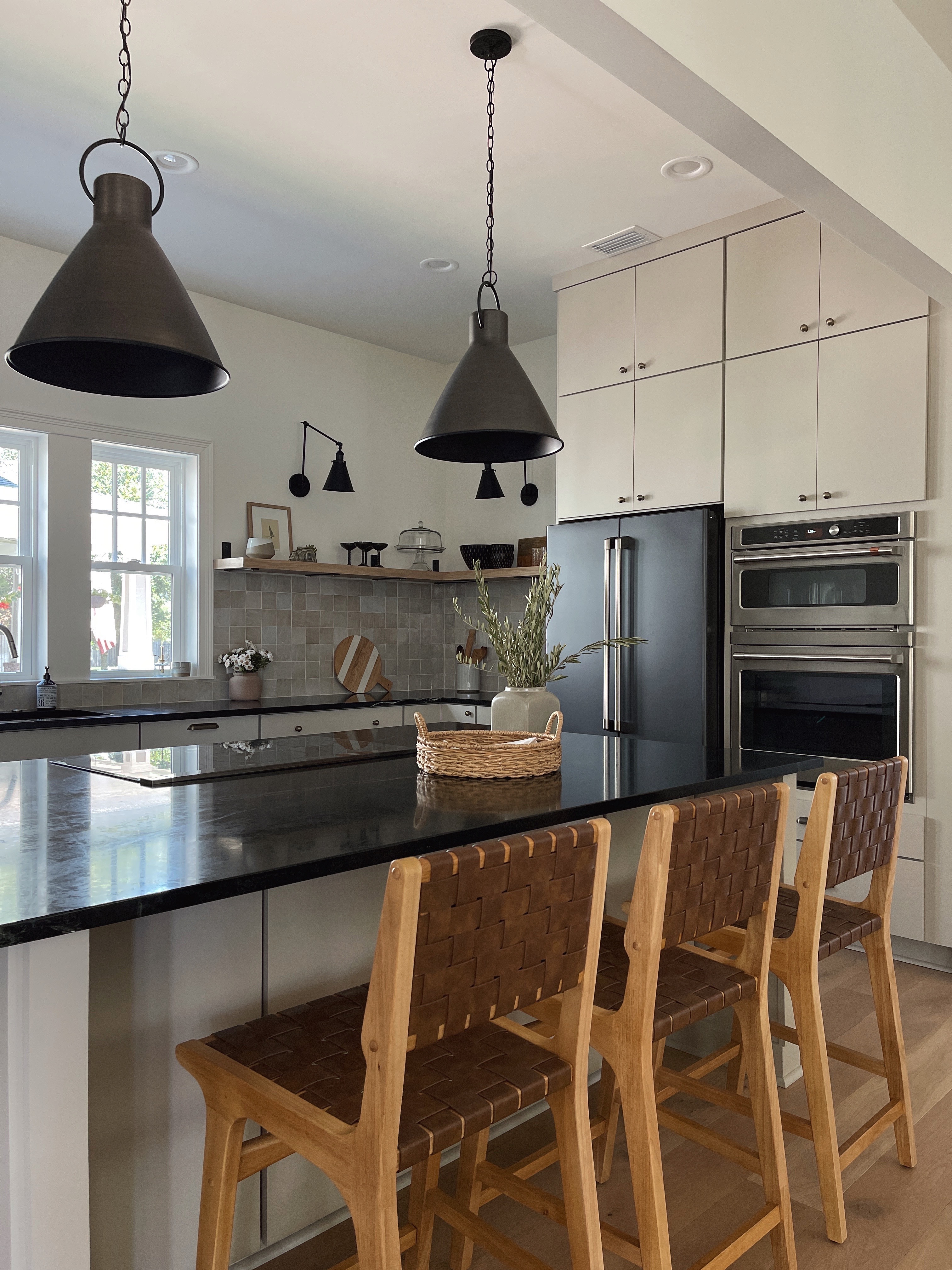
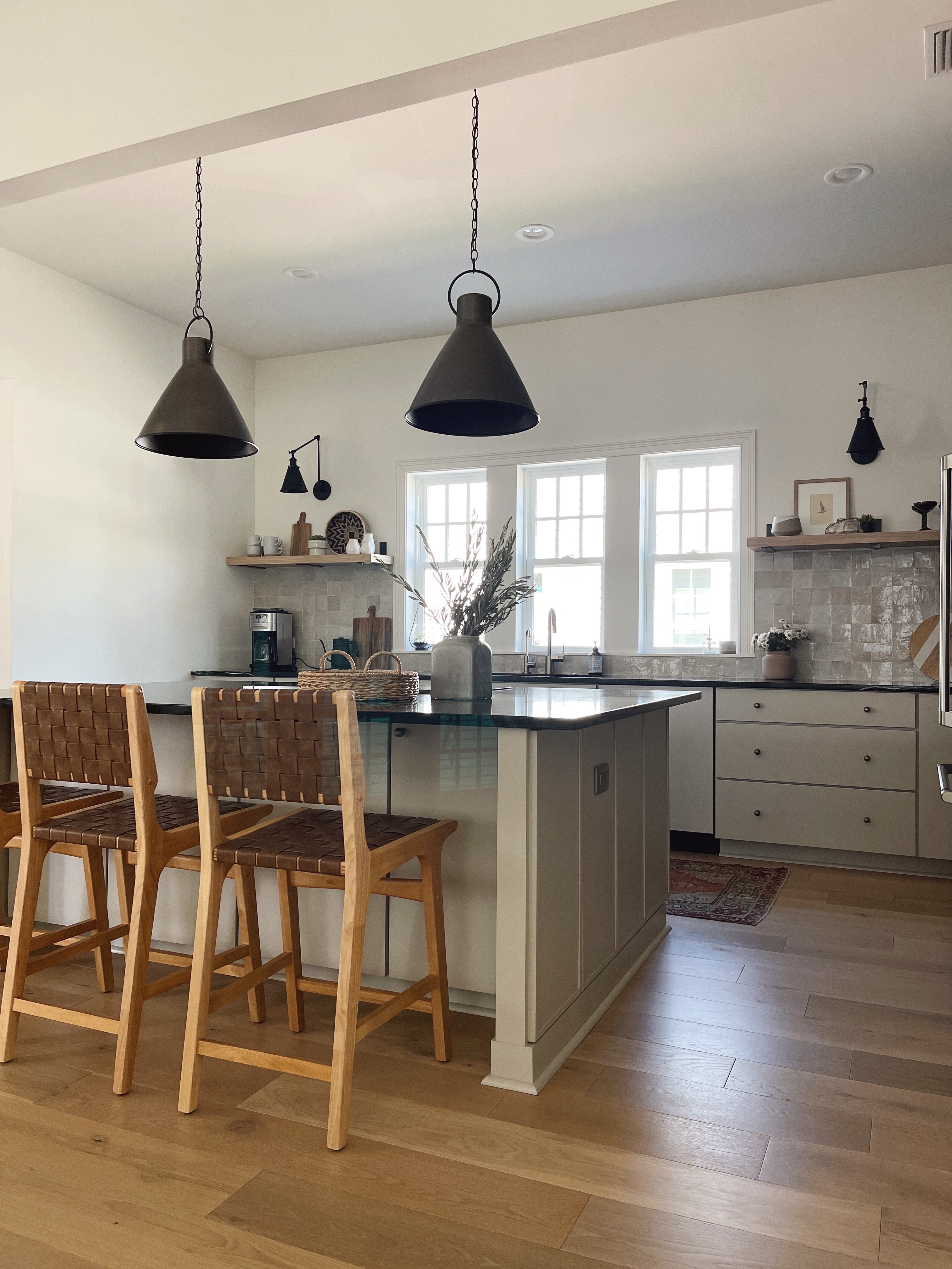
And here's how our "organic modern" kitchen turned out!
ANY CHANGES FROM THE DESIGN PLAN?
We made some pretty big layout changes from our original plan which involved putting a cooktop in the island and having a wall oven instead of a slide-in range. I have no regrets about these changes as the layout functions SO well for us. I was a litle concerned that the cooktop in the island would spoil the aesthetic of the soapstone, but since it's dark gray it sort of blends in. I love being able to cook facing the rest of the room instead of having my back to everyone—it feels nice and sociable.
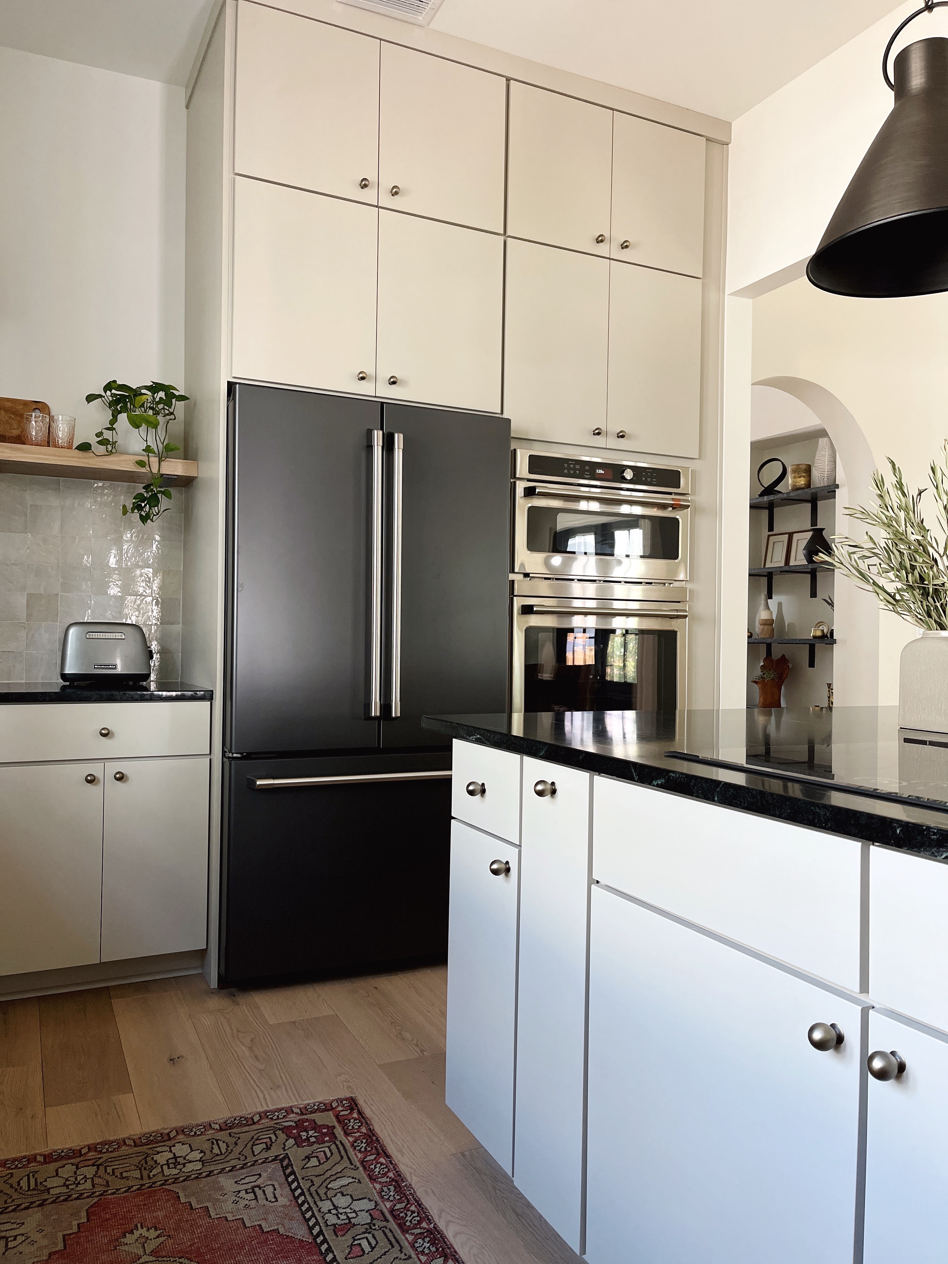
The rectractable downdraft vent hood was a headache to install (and that's being polite) but it does its job very well and I love that it's hidden when not in use.
Originally I had wanted a big plaster hood over a slide-in range, but with all the windows in our kitchen it just wasn't feasible to fit everything in, hence moving the cooktop to the island. I'm planning a plaster fireplace wall instead which will make up for it!
THE KEY PLAYERS
I was drawn to the idea of soapstone from the very beginning of the design process, and despite some reservations we ended up going ahead with it. Lots of people have asked whether we like it 6+ months on, and that topic probably deserves its own blog post! Aesthetically I have ZERO regrets—it is so stunning. In terms of maintenance, I haven't done much at all. I added some oil to it once as an experiment, but I haven't felt the need to keep up with that. Maybe when our list of projects is a little shorter I will get into the routine as it does look even prettier when it's freshly oiled, but for now it isn't a priority.
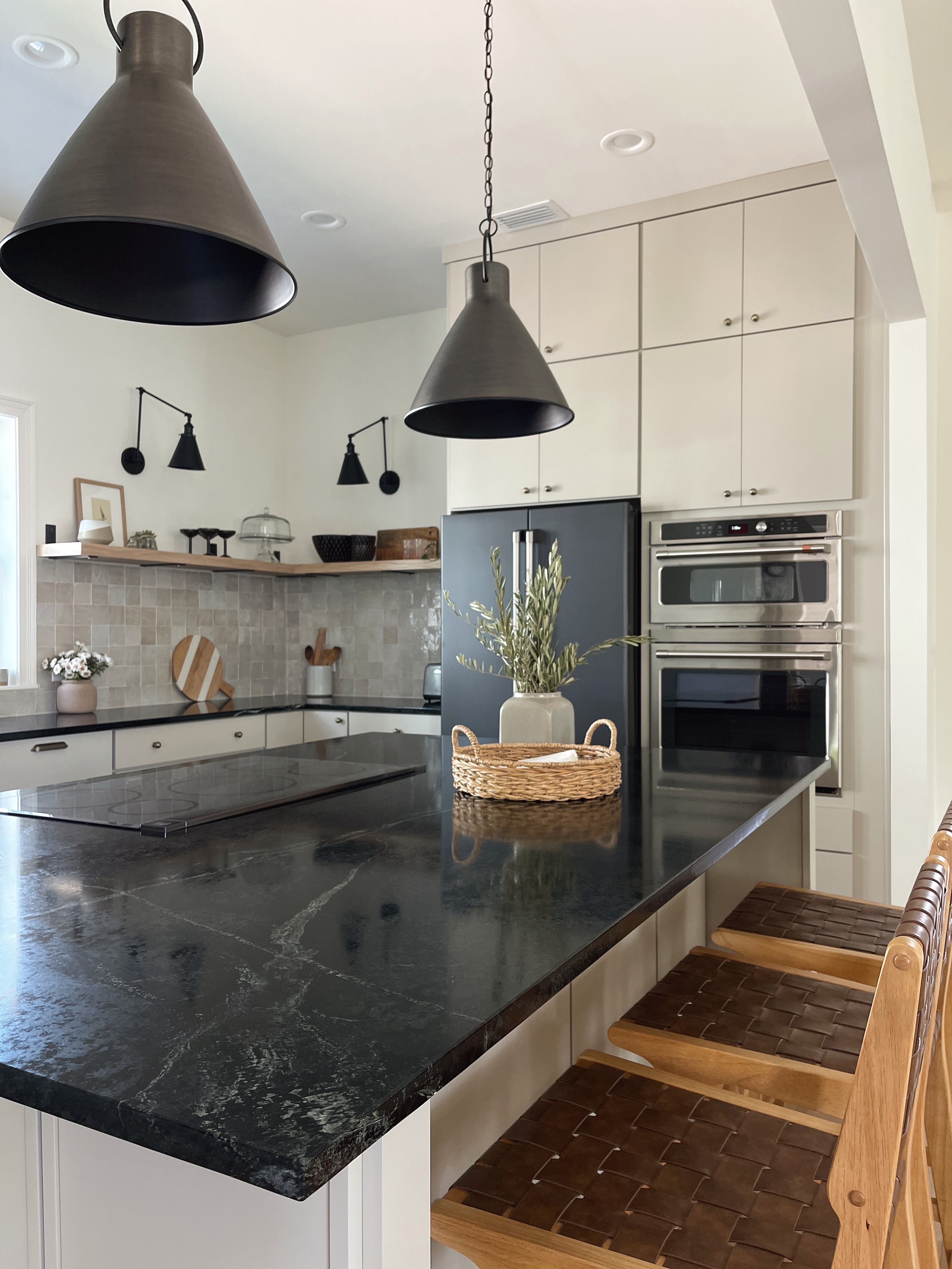
The only downside has been that it chips easily along the edges. I'm hoping that as the surface patinas and ages they will become less noticeable, but that first chip did sting a little! It is possible to mend the chips with epoxy but I'm going to see whether we can live with them. Would I choose it again? I'm pretty sure I would.
Related: All the Countertops We Considered, and What We Ended up Choosing!
Another key design element is our backsplash tile which is 4x4 Moroccan Zellige from Riad Tile. I went with the natural colorway vs. the brighter white which turned out to be a great match for our kitchen cabinets. I love the contrast in texture between the tile and the flat front cabinets and it adds so much character since every tile is unique.
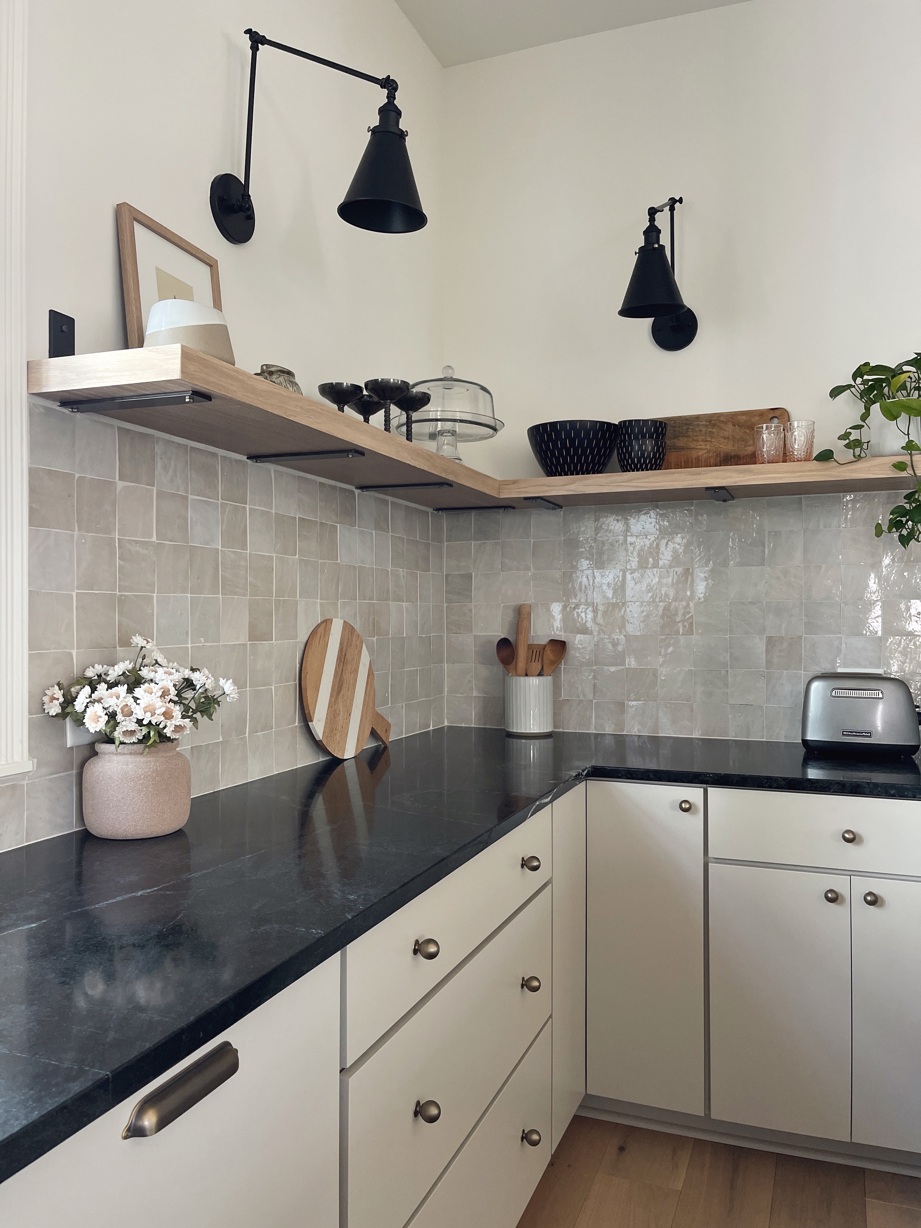
Our open shelving was another decision I made early on that I questioned along the way! I'm happy to say that in terms of storage we haven't missed the upper cabinets at all, especially with a walk-in pantry next door to the kitchen (more on that to come...) and I have only wiped the shelving down once so far since April! I think it helps that it's mostly decorative items on there, so it doesn't matter if they get a little dusty.
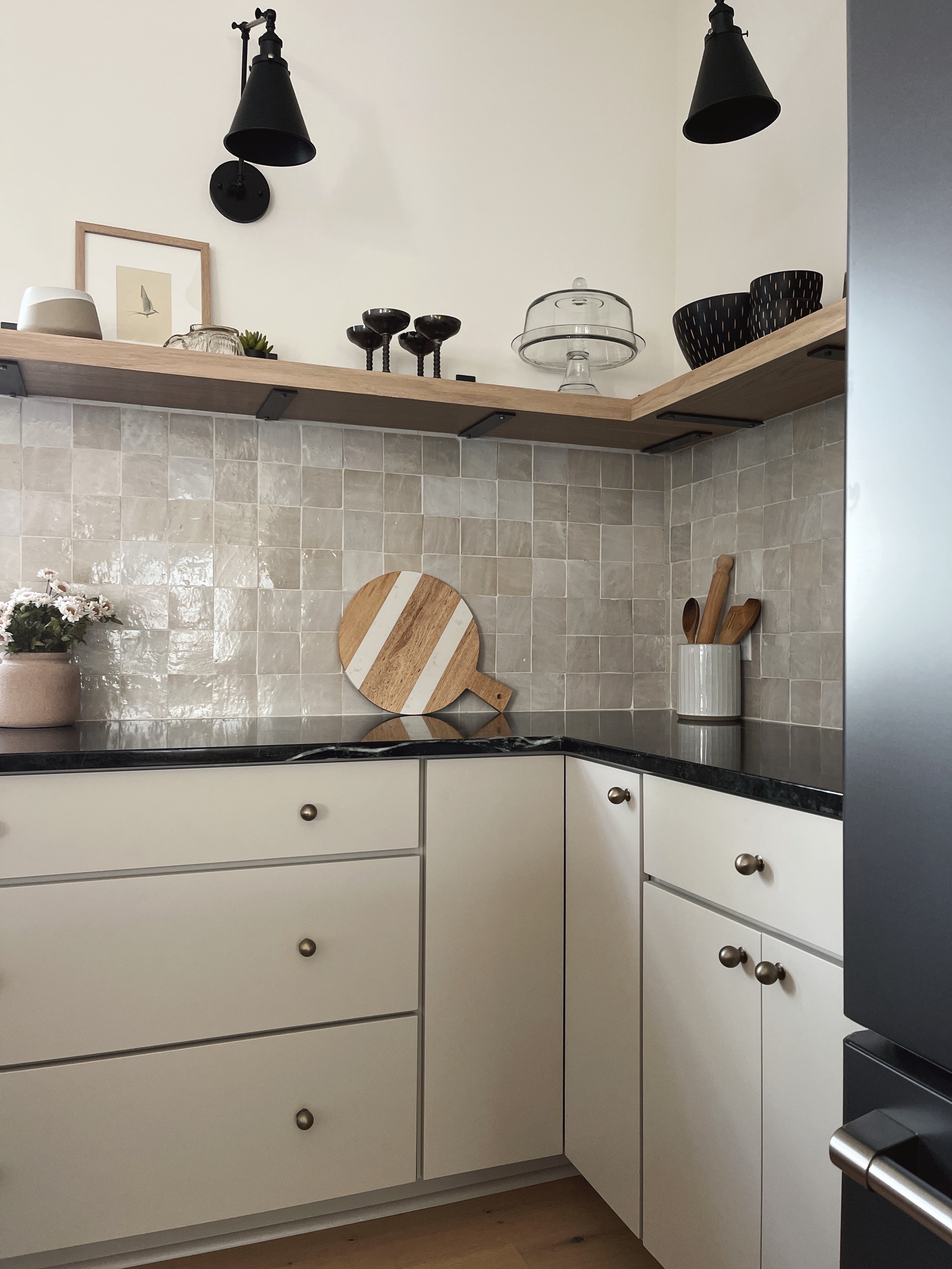
We used heavy duty L brackets in a natural clear coated steel from Cascade Iron Co. for the open shelving. The metal finish ties in beautifully with the other accents in the kitchen, and we used the same brackets in our hallway niche for some shelving made from our countertop remnants—they are super sturdy and I can tell you those shelves are HEAVY!
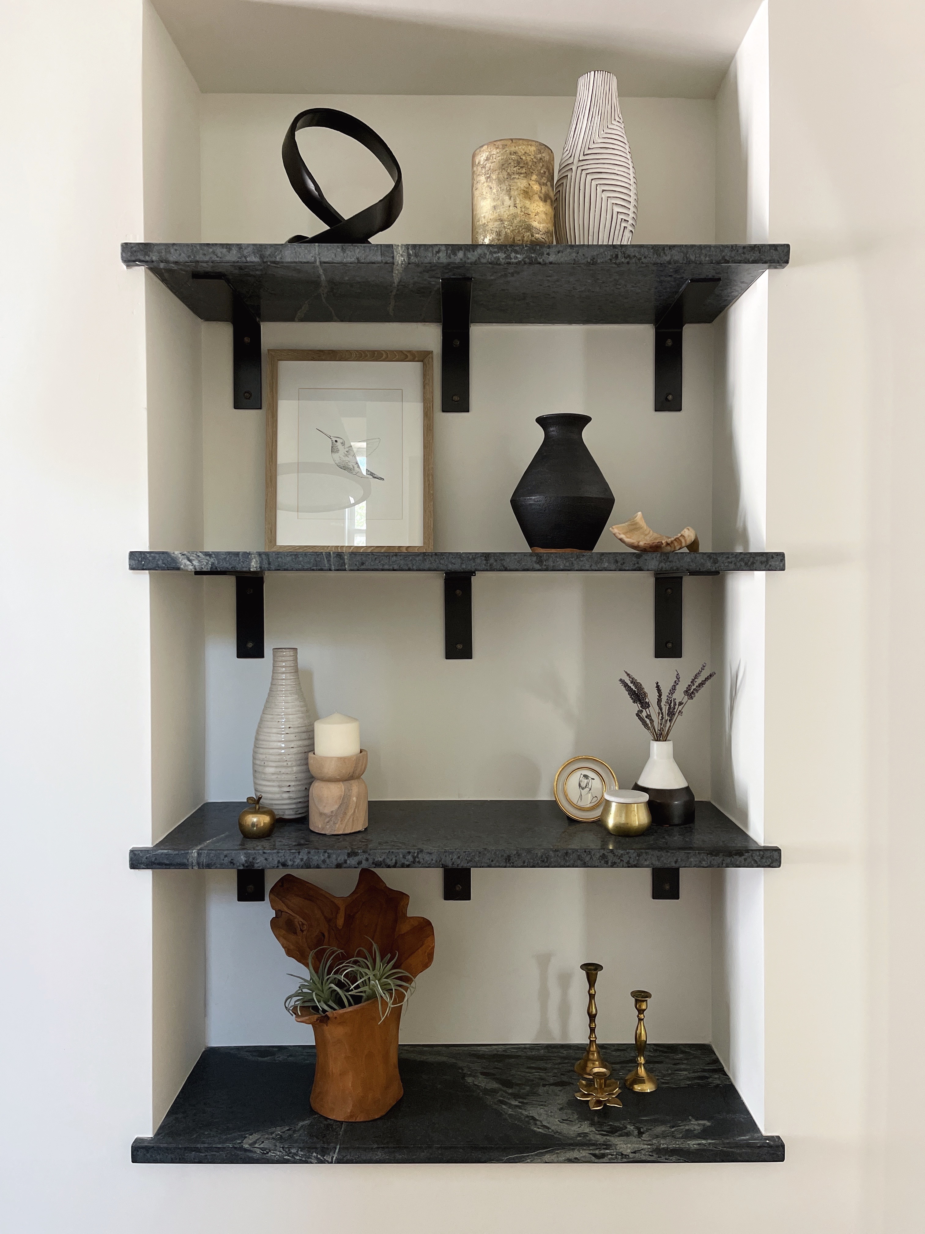
For the kitchen we used the brackets L side up so the tile underneath was uninterrupted and aded notches to the shelving so it ran flat against the wall. For the hallway we flipped the brackets the other way so that the soapstone wouldn't need any notches. Those little details really make a difference and are worth the extra thinking effort in my opinion!
ANYTHING I WOULD HAVE DONE DIFFERENTLY?
I've gone back and forth on this question! I do wonder whether I made the best choice for our cabinet fronts. I originally had my heart set on inset slab cabinet doors, but alas they were out of our budget. The full overlay slab is just not the same look, but I went ahead with the slab front (vs. shaker) as I wanted something that would be super low maintenance. They are definitely easy to clean, and I think they will hold up well over time. I added some decorative panels on either side of the island and I'm really glad we have that detail.
Related: The Vision for Our "Organic Modern" Kitchen
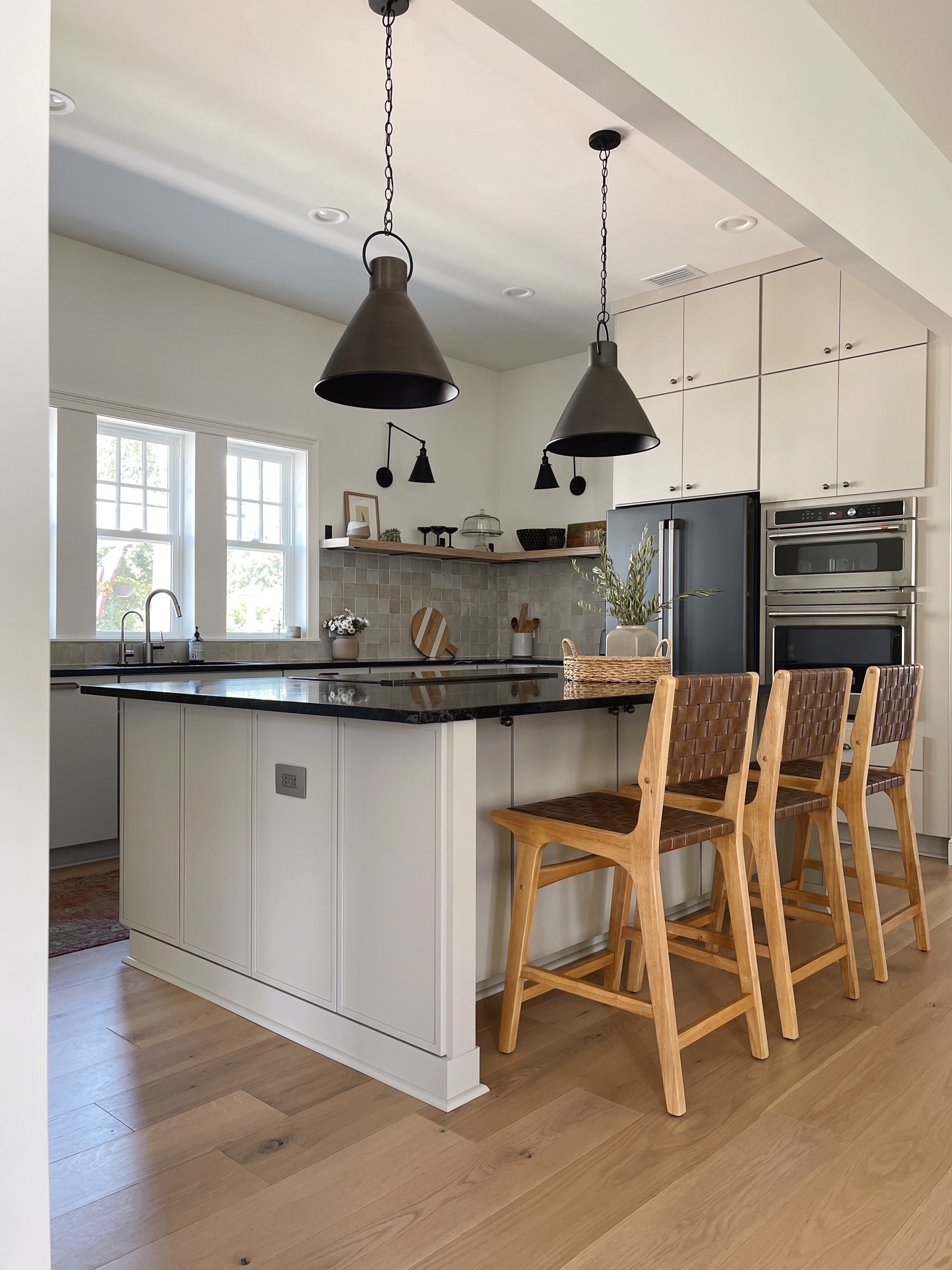
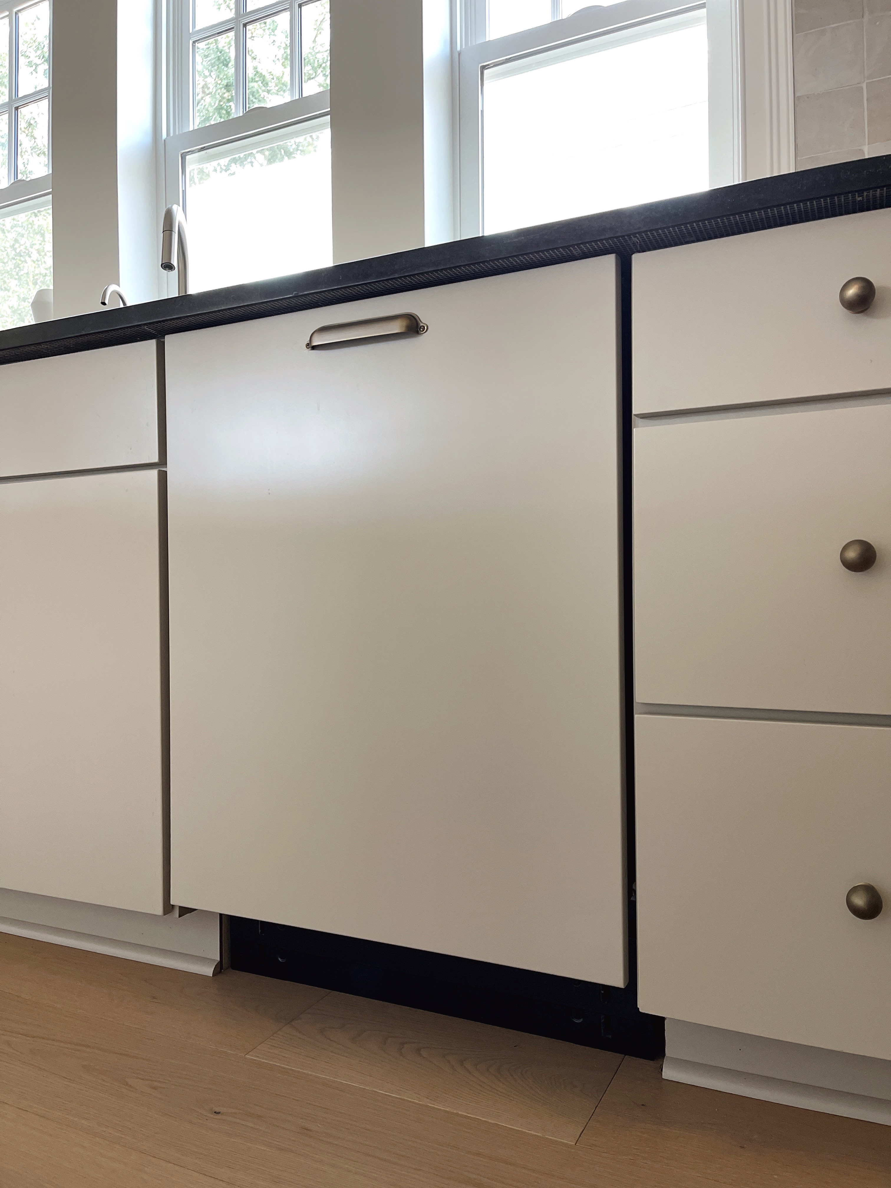
Our dishwasher is hidden behind a cabinet panel which I love, but we didn't think ahead about adding a matching toe kick. It's not too noticeable, but it's something I'd like to look at adding. It would need to be removable, so perhaps something attached with command strips might work.
The other thing I wish I'd thought about ahead of time is our outlets. They are bright white and stick out like a sore thumb (I hid them with some strategic styling for the photos so you'll have to trust me on that one!!) and it would have been an inexpensive upgrade to purchase some off-white/taupe receptacles which would blend so much better. Luckily that's an easy fix, it just hasn't made it to the top of our list yet.
ON THE TO-DO LIST
Along with upgrading the outlets and adding a toe kick to the dishwasher, I may upgrade the sconce lighting one day. The ones we have look fine from a distance but they are not the best quality. I also may have had them wired a smidge too low, so I'm wondering whether choosing a different fixture style would work better. Watch this space!
SOURCES
Wall and trim color: SW White Flour
Wood flooring: Floors For Life Sea Island New Inverness
Cabinets: Medallion Cabinetry in Chai Latte finish
Shelving brackets
Cabinet hardware: knobs | pulls
Backsplash
Pendant lighting
Sconce lighting
Counter stools
Rug: vintage

