I realized it's been four months since I shared the concept for our organic modern kitchen, and there are a whole bunch of changes that I need to catch you up on!
There have been many twists and turns so far in the build process, and we haven't even got to the start line yet... I'm learning that I need to be flexible and open to changes rather than holding on tightly to the original vision. So here's a rundown of all the changes going down in the kitchen, and the reasons why we let go of the first plan.
LAYOUT
About five minutes into our first meeting, the kitchen designer spotted a big flaw in our original layout, and it was one that had to be addressed. Can you spot it?
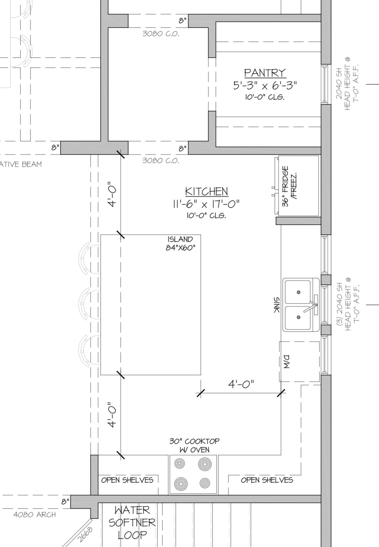
In this original plan, the fridge is located right next to a wall, which means the fridge door wouldn't open fully, and the handle would bang against the wall. It would probably be about 35 seconds before the drywall had a big dent in it. We looked at lots of options, but the one that made the most sense was to move the fridge all the way over to the other side of the kitchen, with a double wall oven next to it. The cook top would move to the large island, with a retractable hood vent. Here's a rendering:
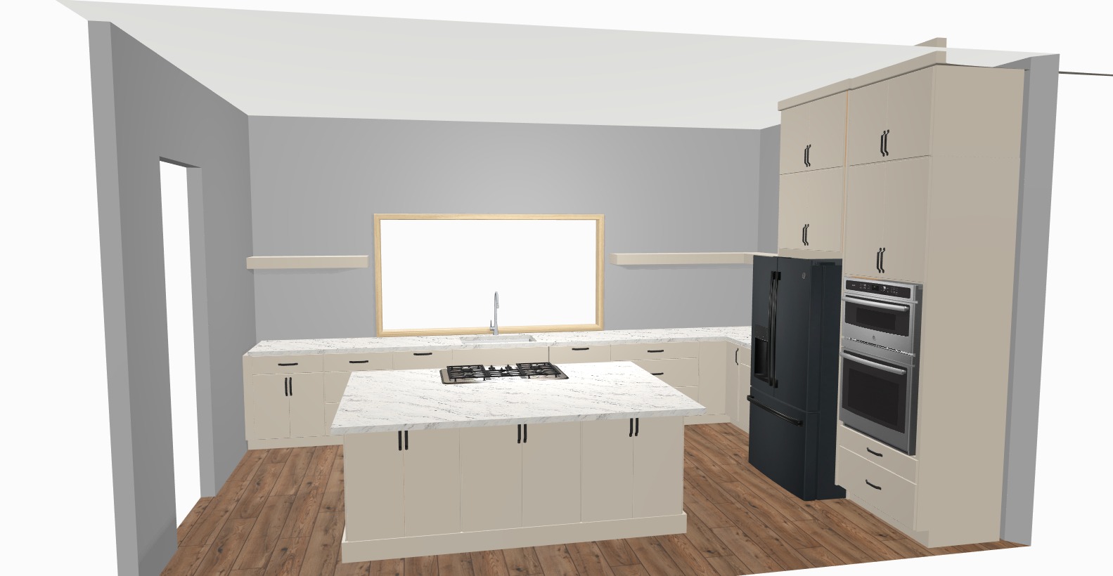
This BIG layout change took me a second to get my head around as it involved losing the plaster-style vent hood cover that I was very excited about, and switching to wall oven rather than a slide-in. I was also unsure about having a cooktop in the island, but after surveying a few people with a cooktop in this location and finding out how much they loved it (sociable cooking, and very easy to feed hungry children across the other side of the island!) we were encouraged to go for it. Plus now the window wall will be completely symmetrical with no appliances in view (we'll be doing a panel-ready dishwasher so that it can blend into the cabinetry.) This layout is nothing like I imagined, but it makes sense for our family and I'm so glad we've landed here!
CABINET STYLE/COLOR
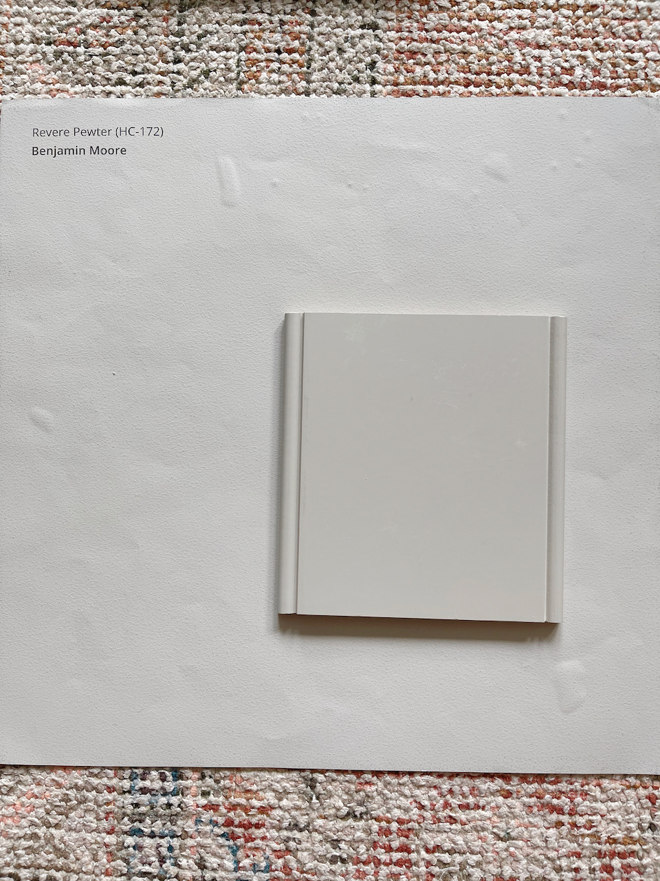
This change is one that no-one would notice really, but it's one that has saved us some money in the budget so I wanted to share! I originally wanted to paint our cabinets Benjamin Moore Revere Pewter, but our kitchen designer suggested we look at standard colors as it would be a lot less expensive. Lucky for us, there was an almost exact match in the Medallion Cabinetry range—it's called Chai Latte and it's going to be beautiful! Look how similar they are:
ISLAND COUNTERTOP
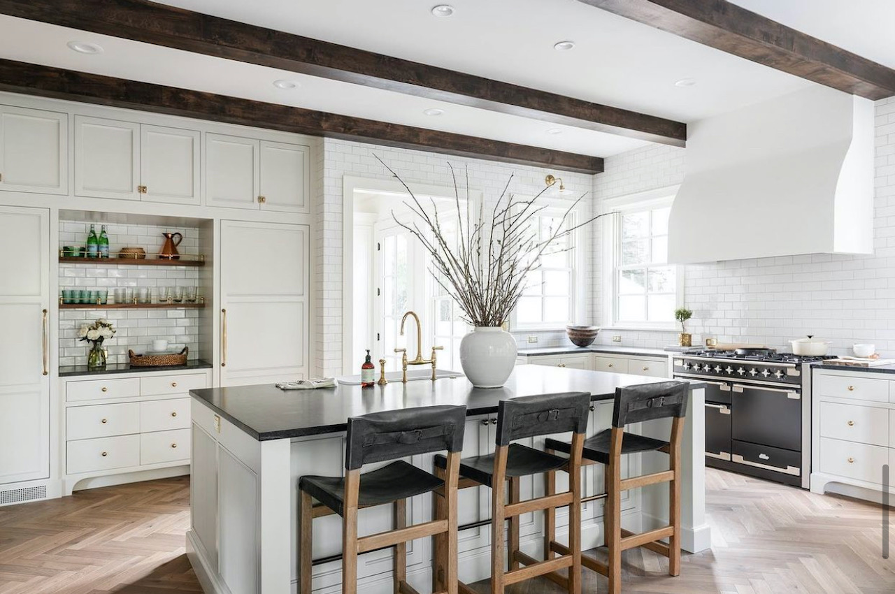
I had always envisioned a waterfall countertop for this kitchen, but a week or so ago Stu commented that he wasn't sure about it. He doesn't often share his opinion on design choices, but the few times he does he usually has a good reason! I started researching images of waterfall countertop islands and noticed that where they are combined with slab front cabinets, the aesthetic is very modern. And it might be a little too modern for us.
The other big consideration is the budget—a waterfall edge is obviously using a lot more stone* than a regular island edge which means a significant price increase.
As an alternative, I'm thinking a nice clean square edge with some shaker-style panels either end of the island to contrast with the slab cabinet doors everywhere else. I think that little bit of cabinetry detail will make the whole kitchen feel more of a classic/modern mix—which is exactly what we are aiming for:
*We are still deliberating over countertops. I'll share all the options we've considered in a separate post!
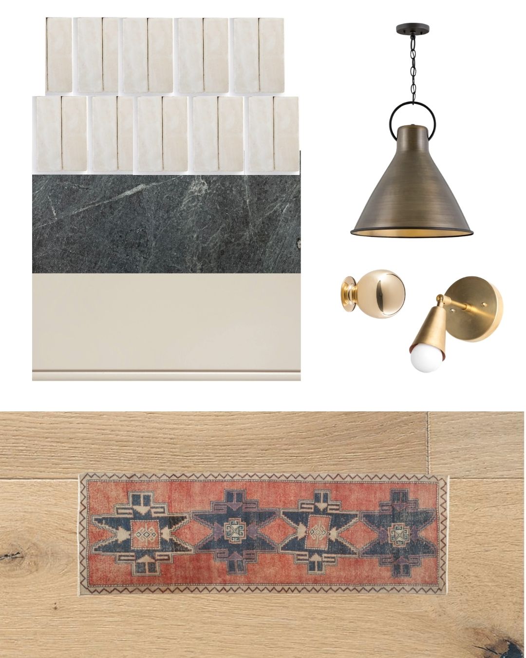
LIGHTING
I'm not really surprised at this change as the ones I picked out originally were just placeholders really, but I'm going to be mixing some metal tones in the kitchen lighting design, based on my plan for metals and finishes throughout the house. I'm going with a simple raw brass sconce for the perimeter of the kitchen which will tie in well with the unlacquered brass knobs—both will patina over time. The pendants will be a darker brass which will add a little more depth and blend well with the oil rubbed bronze that will be used in close range (door hardware, curtain rods, mudroom/pantry lighting.)
TILE SHAPE...MAYBE?
I'm still set on the natural zellige I originally picked out, but I've started to lean towards a 2x6 in a vertical stack. The layout gives it a modern feel, and the texture brings the character. Honestly, this change is probably going to be something I just decide in the moment. The zellige is beautiful, and there isn't really a wrong decision. I just prefer the classic rectangular tile in this moment. I could quite easily revert back to the squares next week! I like them both, a lot. So it's probably just oging to be a gut decision in the moment—or I'll let one of my kids decide.
With all these changes, here's how the moodboard is looking now:
(Here's the original design plan if you want to look back to compare!)
I'm not going to promise that there won't be any more tweaks to the plan, but I am feeling pretty good about the latest version. As we approach the start of the build we are getting closer to the stage of actually having to sign off and make final decisions...which makes me nervous, ha! I'm hoping that my intuition will kick in when it is needed and I'll know the choices I need to land on.