Earlier this year I made a list of projects that we would focus on in 2023 and our primary bathroom was top of the the list as it was very close to completion—all this space needed was a few styling touches, some paint touch ups and a whole lot of cleaning.
For quite a few months after moving in, it wasn't a priority for us to finish up our bathroom as there were more important things to deal with so it became second nature for us to ignore the large box containing a light fixture for over the bathtub—even though it was blocking an entire linen closet. Stu decided to install it one weekend in January and we instantly felt like we gained so much extra storage and floor space in the room! This gave us some momentum to finish up the rest of the jobs...and now it's all done and we can check this room off the list. That always feels good.
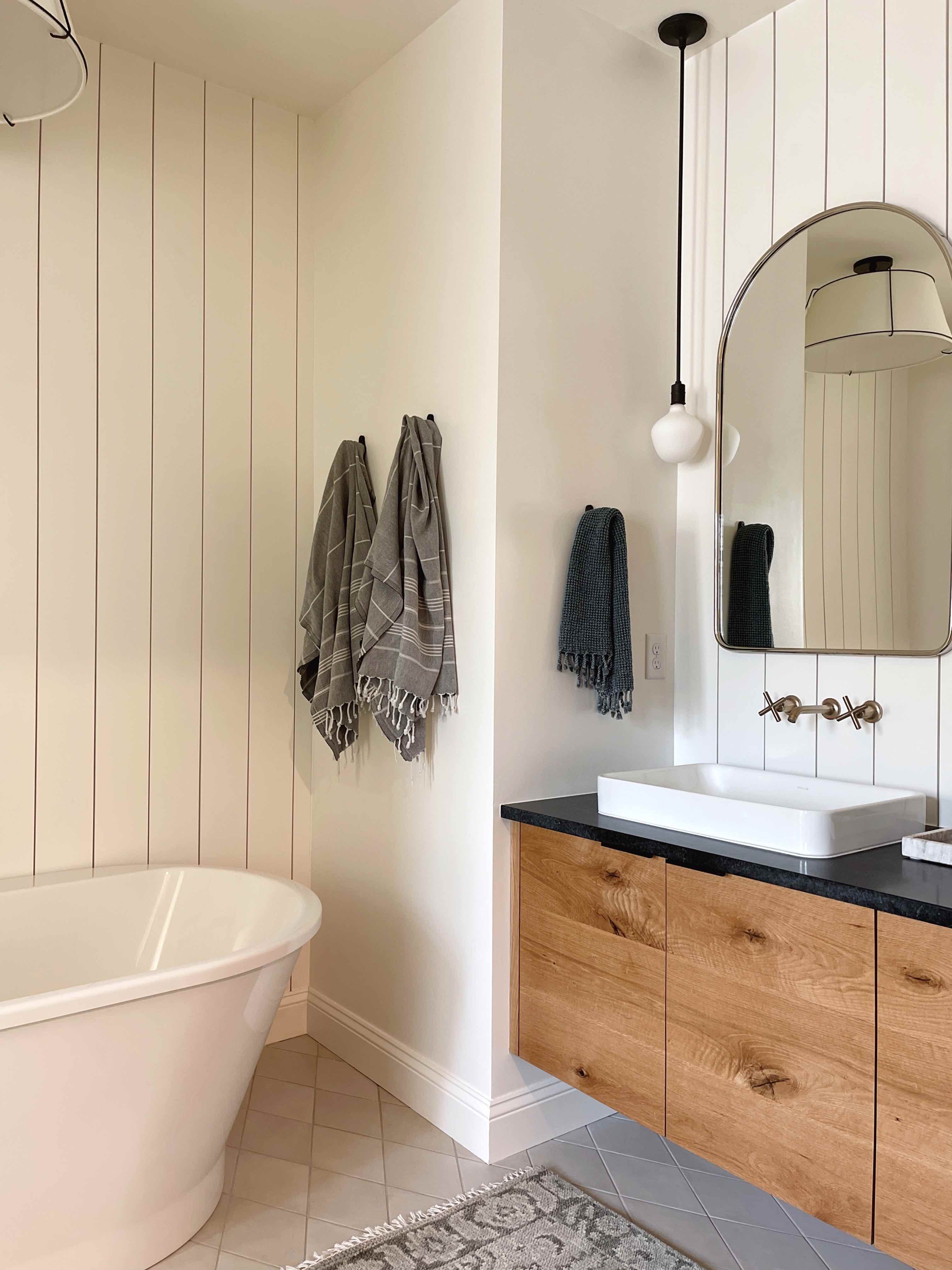
There were some pretty big changes to my original design plan along the way, but I much prefer where we've landed to where I started. Sometimes you just need to start over with a design—and that's ok. I did have a lot of uncertainty with how it would turn out as there are a lot of different elements in the mix, but I think everything is working together pretty well and it is growing on me even more with all the final tweaks finished up.
Related: Some Big Changes to Our Primary Bathroom Design!
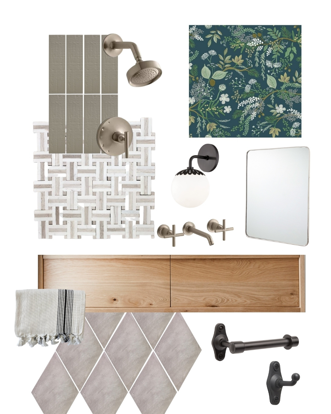
Here is the final design plan for the bathroom:
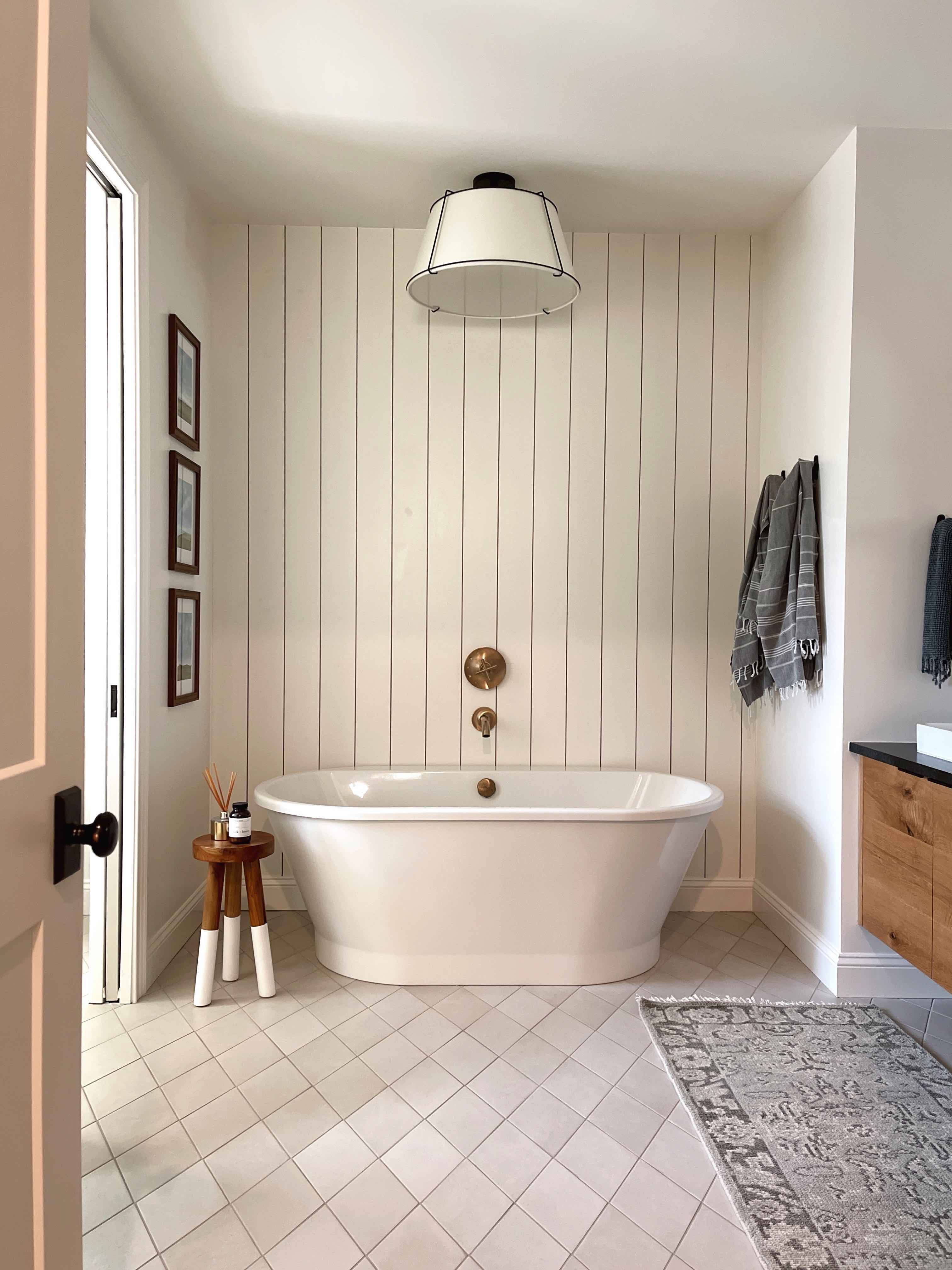
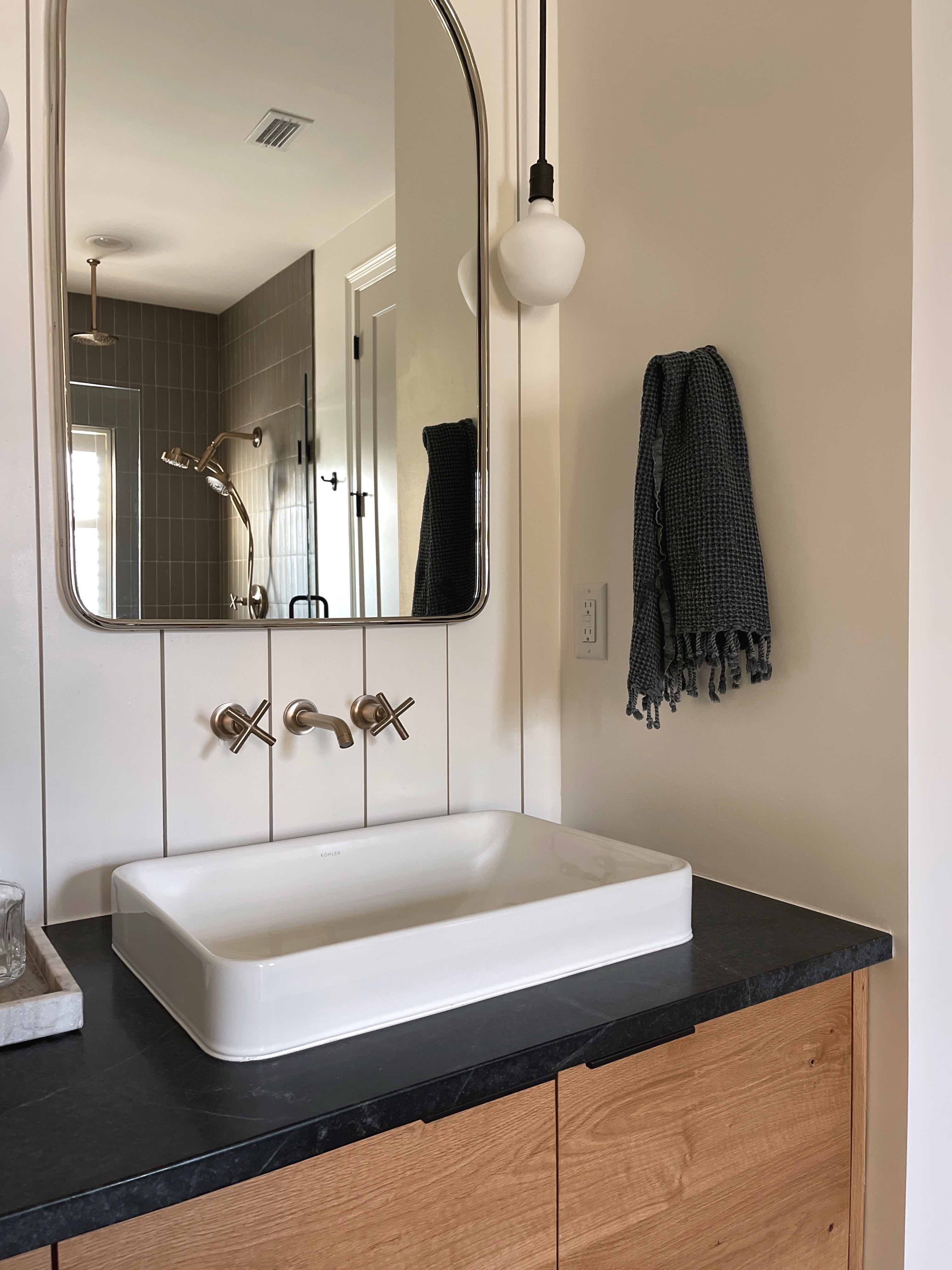
And here's how it turned out!
ANY CHANGES FROM THE DESIGN PLAN?
I ended up staying pretty close to the second design plan I came up with, with a few small changes:
-
I went a shade lighter with the diamond floor tile. The colorway is described as "white" but I would say it's more of a light taupe. The undertones worked much better with our paint colors than the original colorway I had picked out.
-
I ended up choosing pendants instead of sconces for the vanity area due to spacing...more on that later. I also decided on a stunning drum light for above the bathtub rather than a chandelier, so that it would be a more diffused light source.
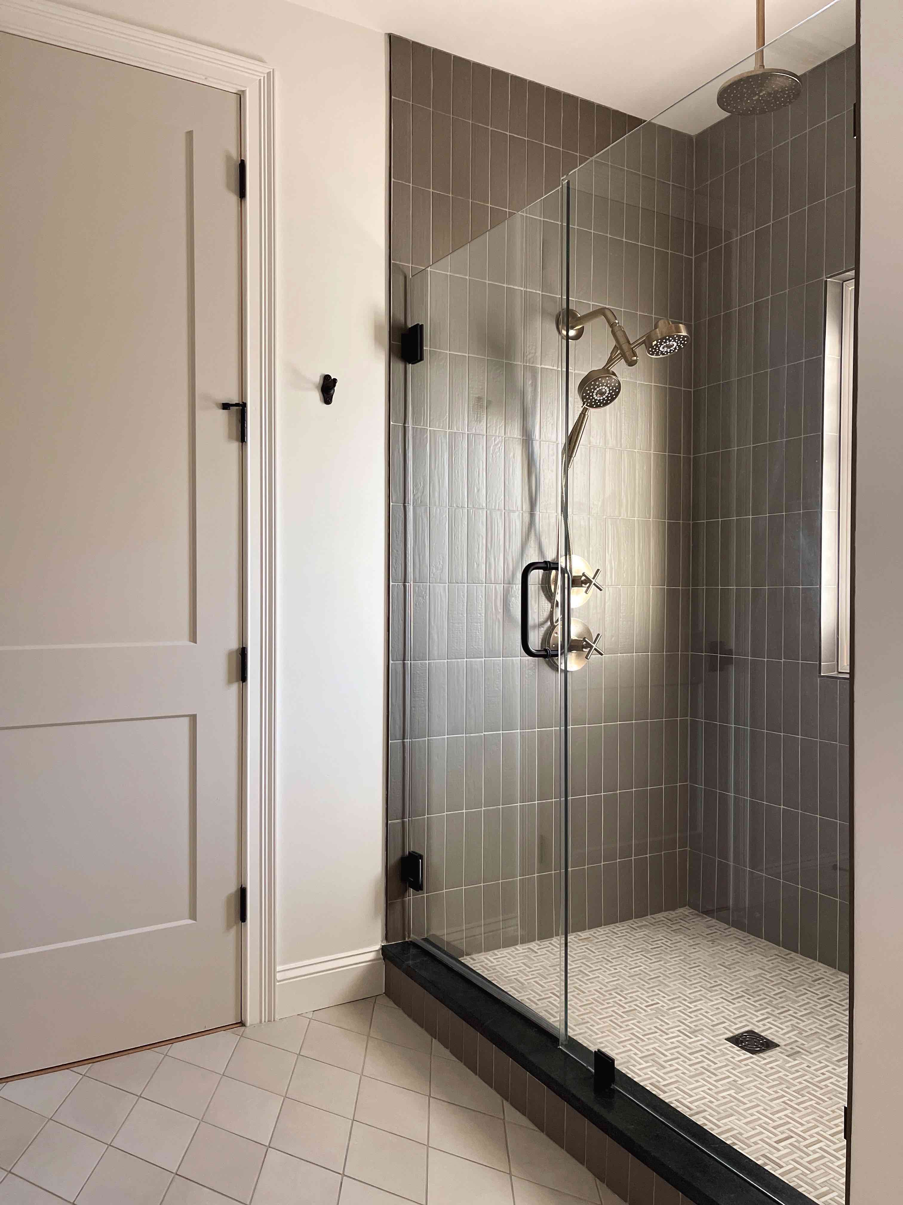
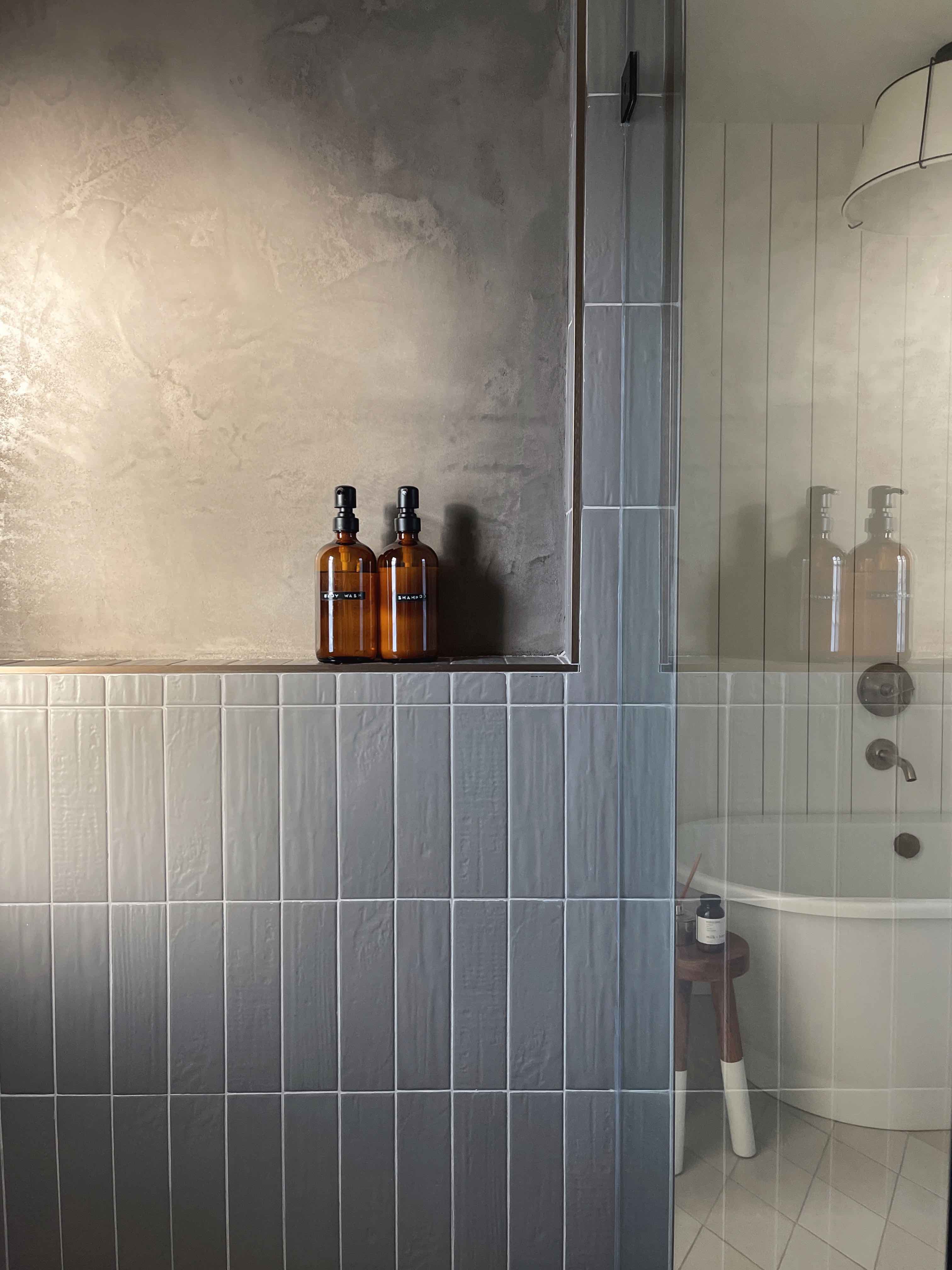
- There was a mishap with measuring for tile in the shower and we ended up short...and then the colorway was discontinued and I couldn't order any more. Thankfully I noticed it ahead of time and was able to come up with a Plan B.
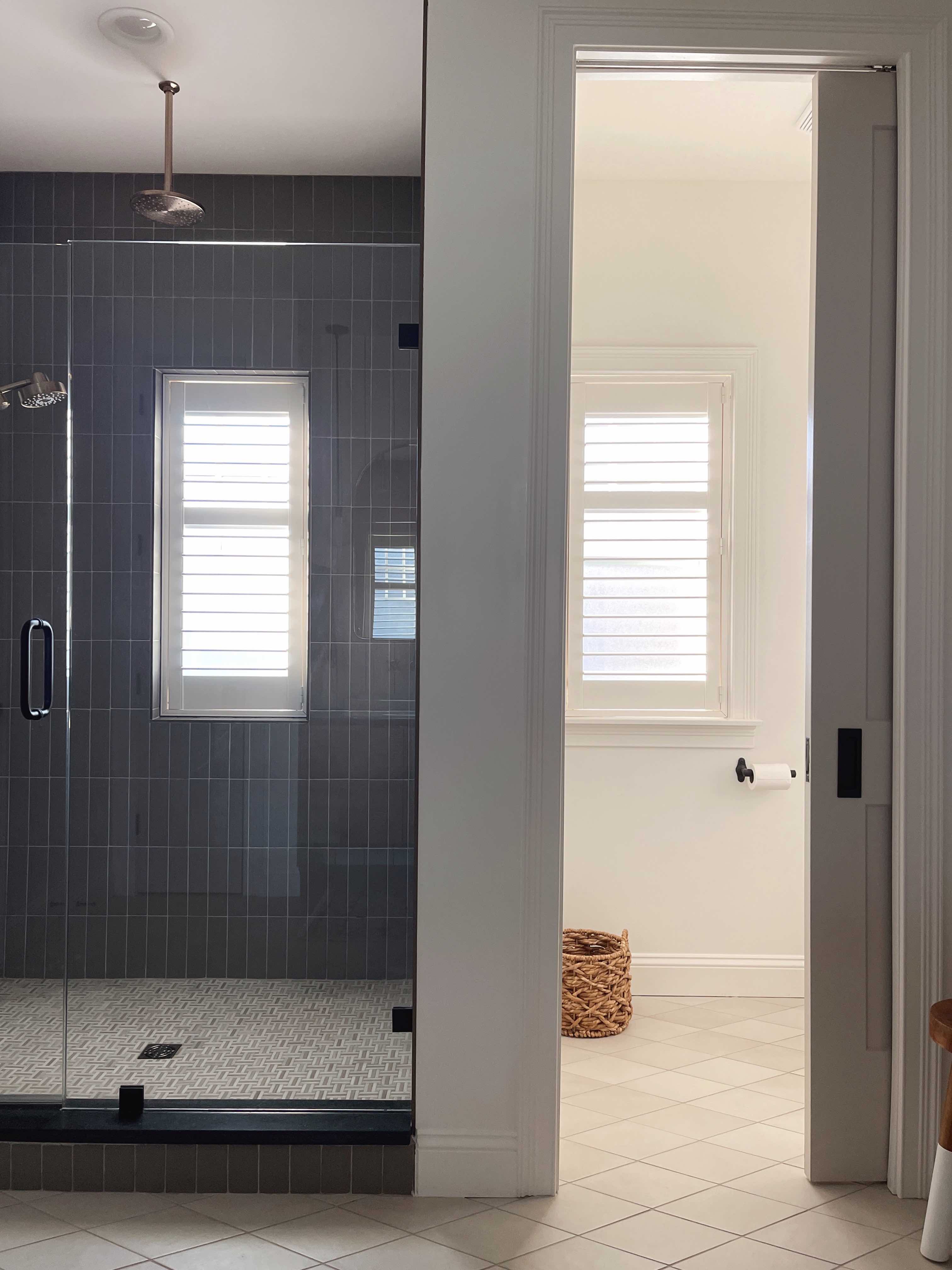
The solution? I found a local finishing company who were able to do a half wall of waterproof Tadelakt plaster above the shower shelf. We color matched it with the tile and it has turned out to be one of my favorite things about this bathroom! It feels very unique, and I think it looks like it was the plan all along. Budget wise, tile would have been much cheaper, but I didn't want to add a fourth tile into the mix, so I think this was money well spent, even if it was an unplanned expense. I LOVE how it turned out—although it was stressful to figure out at the time!
THE KEY PLAYERS
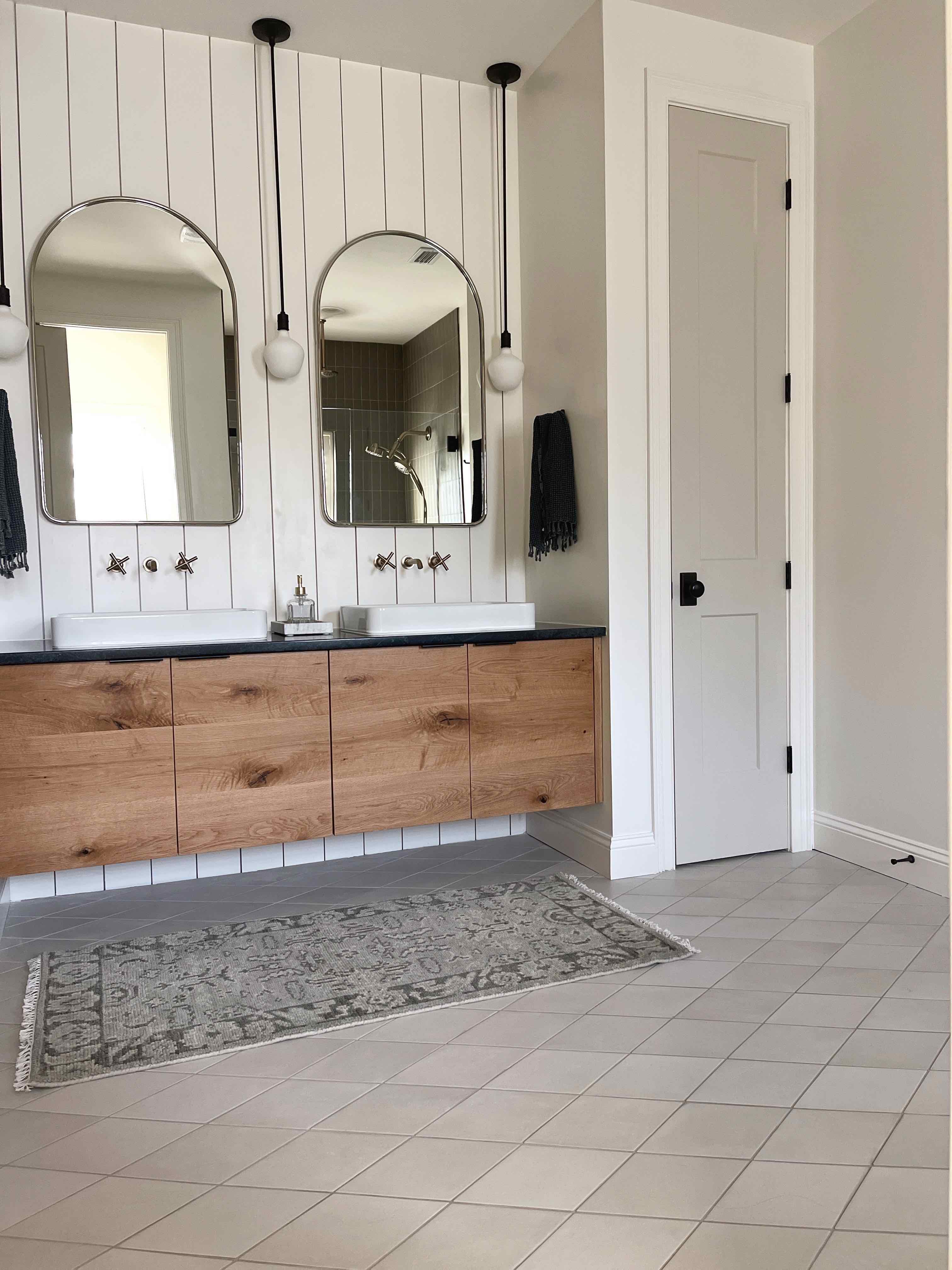
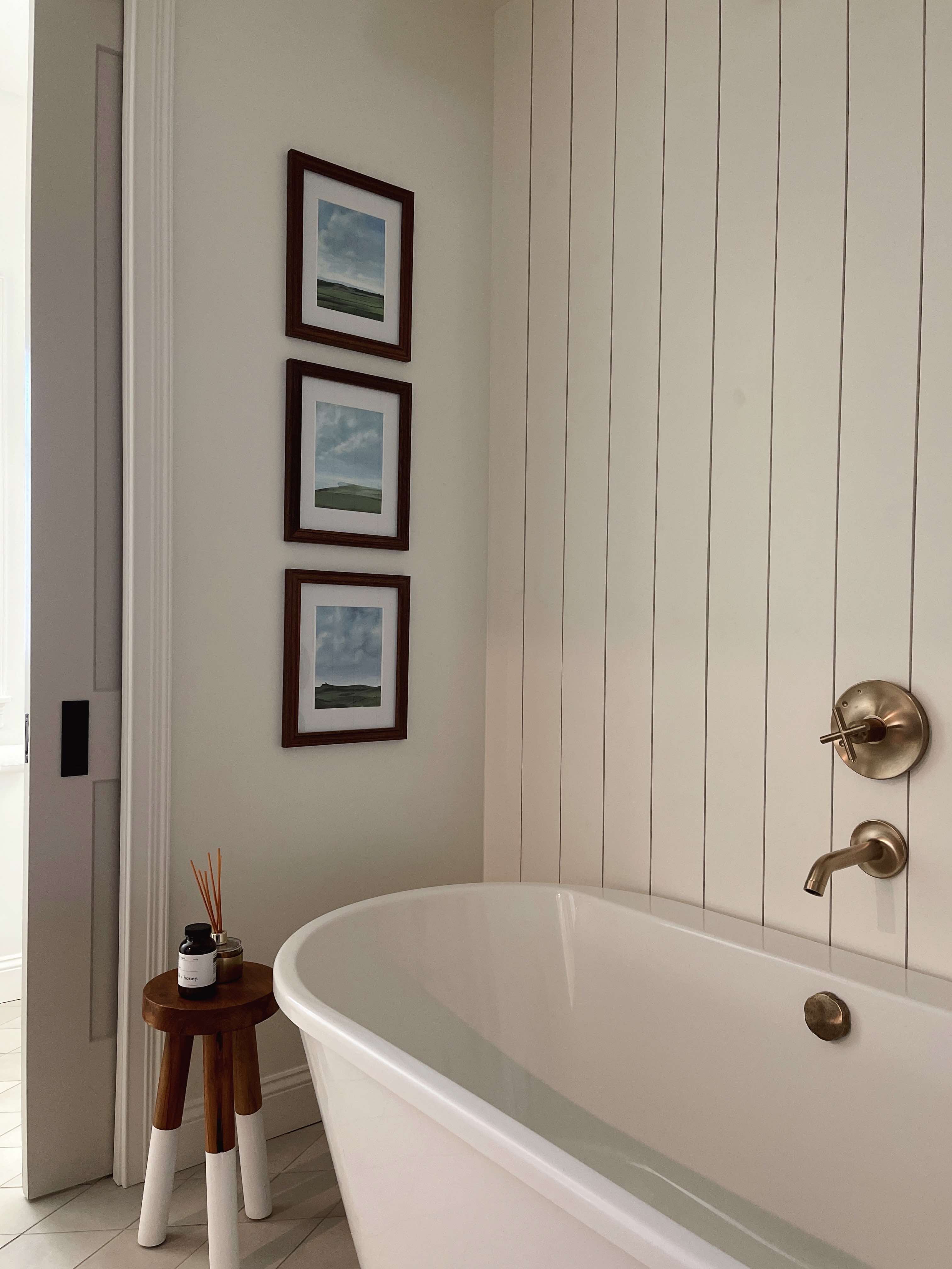
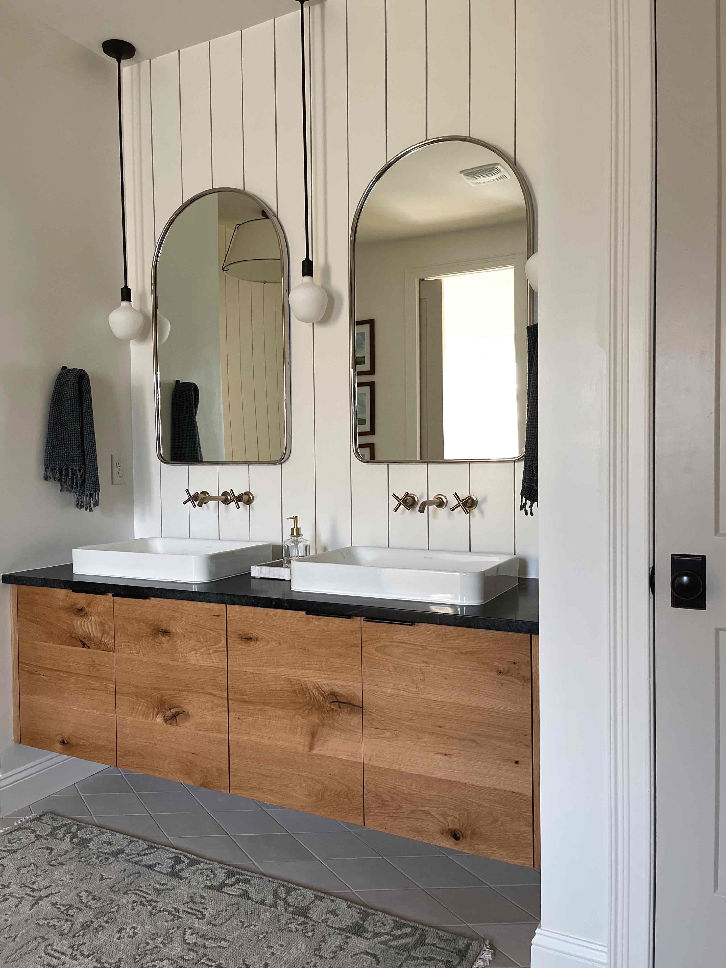
I have a lot of "favorites" in this bathroom—I've already mentioned the plaster, but I am especially pleased with the vanity/faucet/mirror combo. The vanity was a custom build by Brooklyn Roots who also built our laundry room cabinetry. We used leftover soapstone from the kitchen for the vanity countertop and shower curb, which was a good move as we only had to pay for the fabrication.
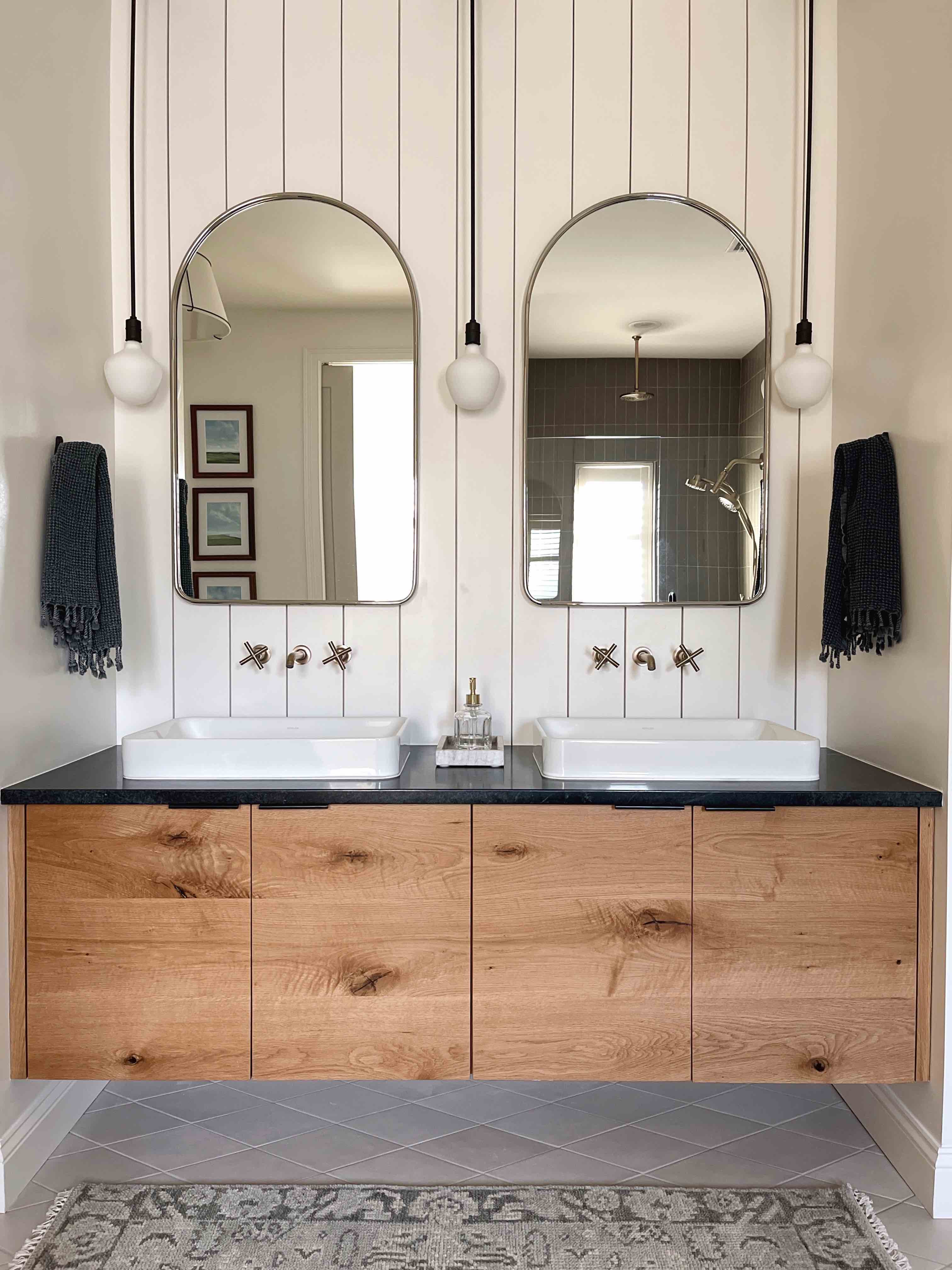
I had been drawn to wall-mounted faucets in a lot of my original inspiration photos, and I think this was the perfect bathroom to utilize them, especially with the matching wall-mounted tub filler. I chose Kohler because of the range of finishes—I wanted something matte and the "vibrant brushed bronze" is almost as if nickel and gold had a baby. It's very pretty and has just the right amount of warmth. I will say that it shows water marks badly which I was trying to avoid by choosing a brushed finish. I plan on reaching out to Kohler and seeing if there is a cleaning product that will help with that.
ANYTHING I WOULD HAVE DONE DIFFERENTLY?
This was a tricky room to design in comparison with others in our house that just "clicked". I went through many different tile options along the way, and the shower floor was one that I was pretty set on. In fact, I wish I'd gone for something different. The pattern competes a lot with the diamond floor tile, and I think something less busy would have been a better option. I even asked about plastering over it with Tadelakt to match the shower wall, which is an option, but it is way low down the list in terms of spending money on the house. It's nice to have that as a potential option for the future...and I don't mind the tile as much now that I've lived with it for a while.
Another thing I don't think I got quite right was the pendant lighting. The scale doesn't seem quite right to me, and they are installed a little too close to the wall (which was my fault.) This was such a tricky area because of the limited spacing, but I was set on having those gorgeous arch mirrors (no regrets) and I wanted to have "face height" lighting as overhead vanity lighting can be quite unflattering—and I need all the help I can get at 5am. It doesn't bother me enough to change them out, but it's something I would pay closer attention to next time if we ever build another house!
ON THE TO-DO LIST
The only thing left to do in here is to add wallpaper to the toilet room! I think this will be such a fun way to add personality and maybe even a splash of color to the space without it being front and center. We will likely look at installing it when we are ready to add it to the girls' bedrooms, hopefully later this year.
SOURCES
Wall color: SW White Flour
Trim color: SW Modern Gray
Floor tile
Shower wall tile (color is discontinued)
Shower floor tile
Plumbing trim—Kohler Purist Collection in Vibrant Brushed Bronze
Mirrors
Robe hooks
Pendant lights and lightbulbs
Flushmount
Door and closet hardware
Artwork
Rug
Teak stool
Vanity tray
