You guys voted on Instagram to see the kitchen design plan next, and I am more than happy to oblige! This is probably the room I have been most excited to work on—I love the balancing act of aesthetic and function in design, and I would say that the kitchen is the spot where this concept is most important given that it's such a heavily used space.
I tend not to put a label on my style, but after putting my design board together I realized that the best term to describe this kitchen is "organic modern"—meaning that there are a lot of clean lines and modern elements which are softened by use of natural materials and textures.
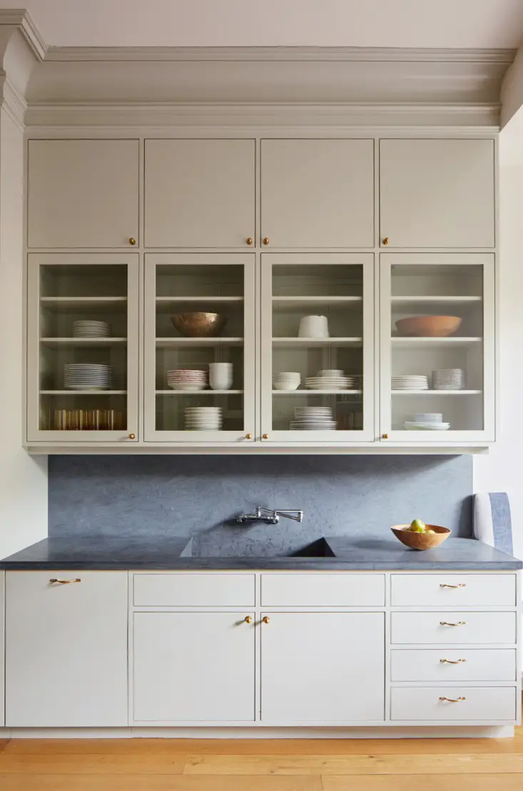
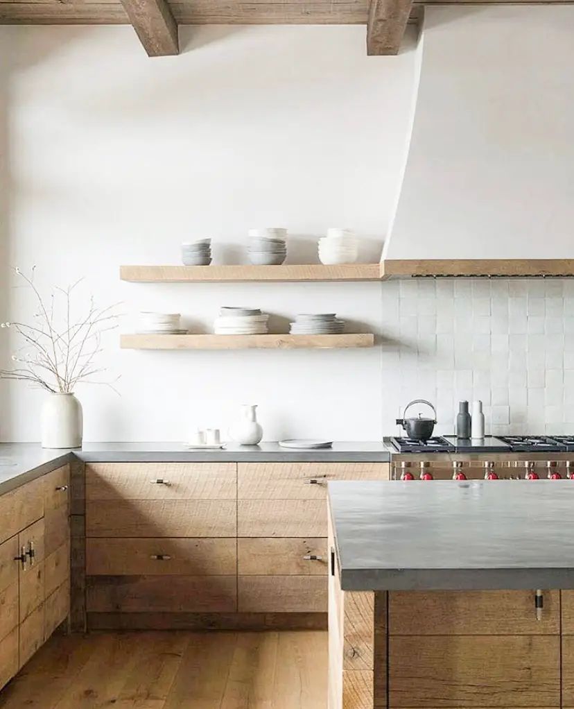
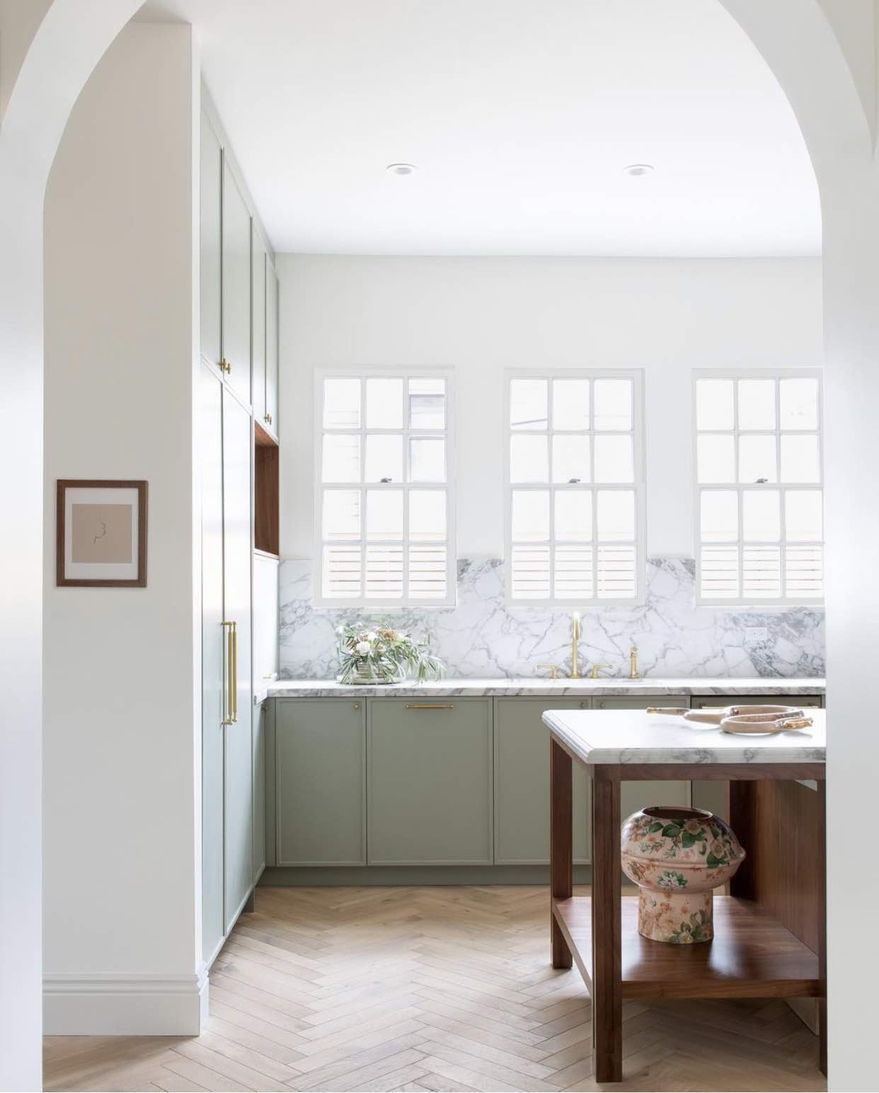
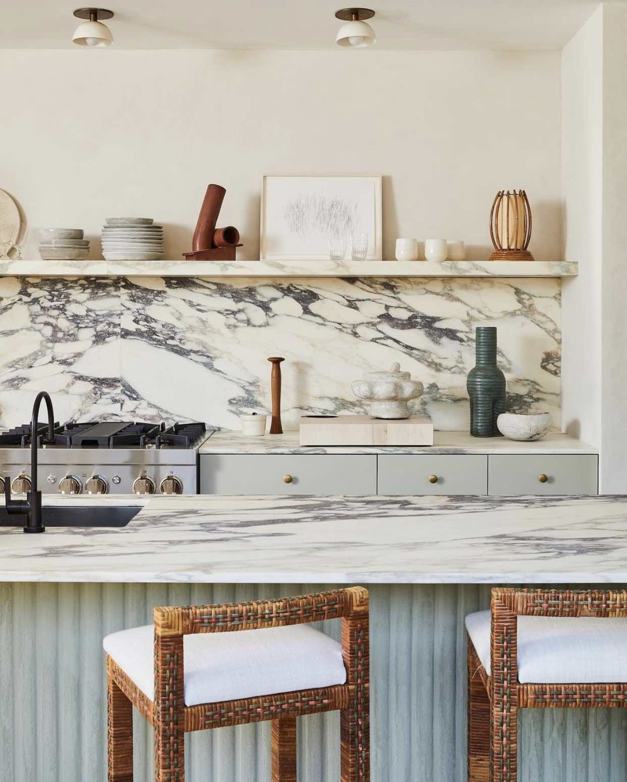
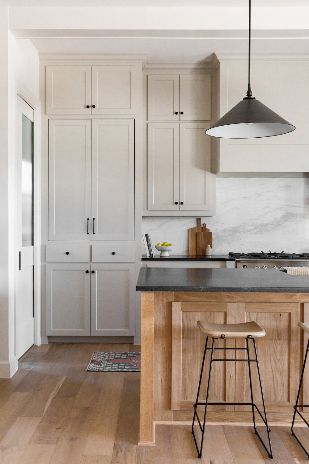
Let's start by looking at some of the inspiration photos I've been saving and studying:
And here's the floor plan for our space:
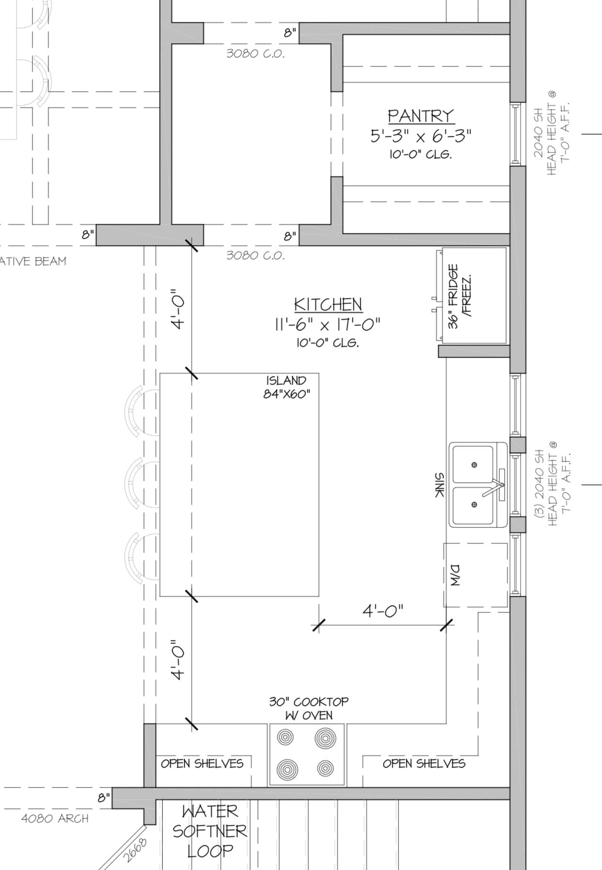
The biggest "aesthetic vs. function" decision I made in this space was deciding not to include upper cabinets. This was initially an aesthetic decision as I love the clean, spacious look of a kitchen with no uppers, but actually turned out to be a practical one as well: firstly, we'll save a lot of money. And secondly, this kitchen is much larger than anything we've ever had before PLUS we have the walk-in pantry, so I feel comfortable that we will have more than enough storage. What's the use of paying for cabinets we don't need? In terms of cabinet design and functional storage, I plan on doing back-to-back 12 inch depth cabinets under the kitchen island for dishes and glassware, and a pull out right next to the oven which will store oils and spices.
OK, I've talked enough about function, let's look at the mood board for our kitchen!
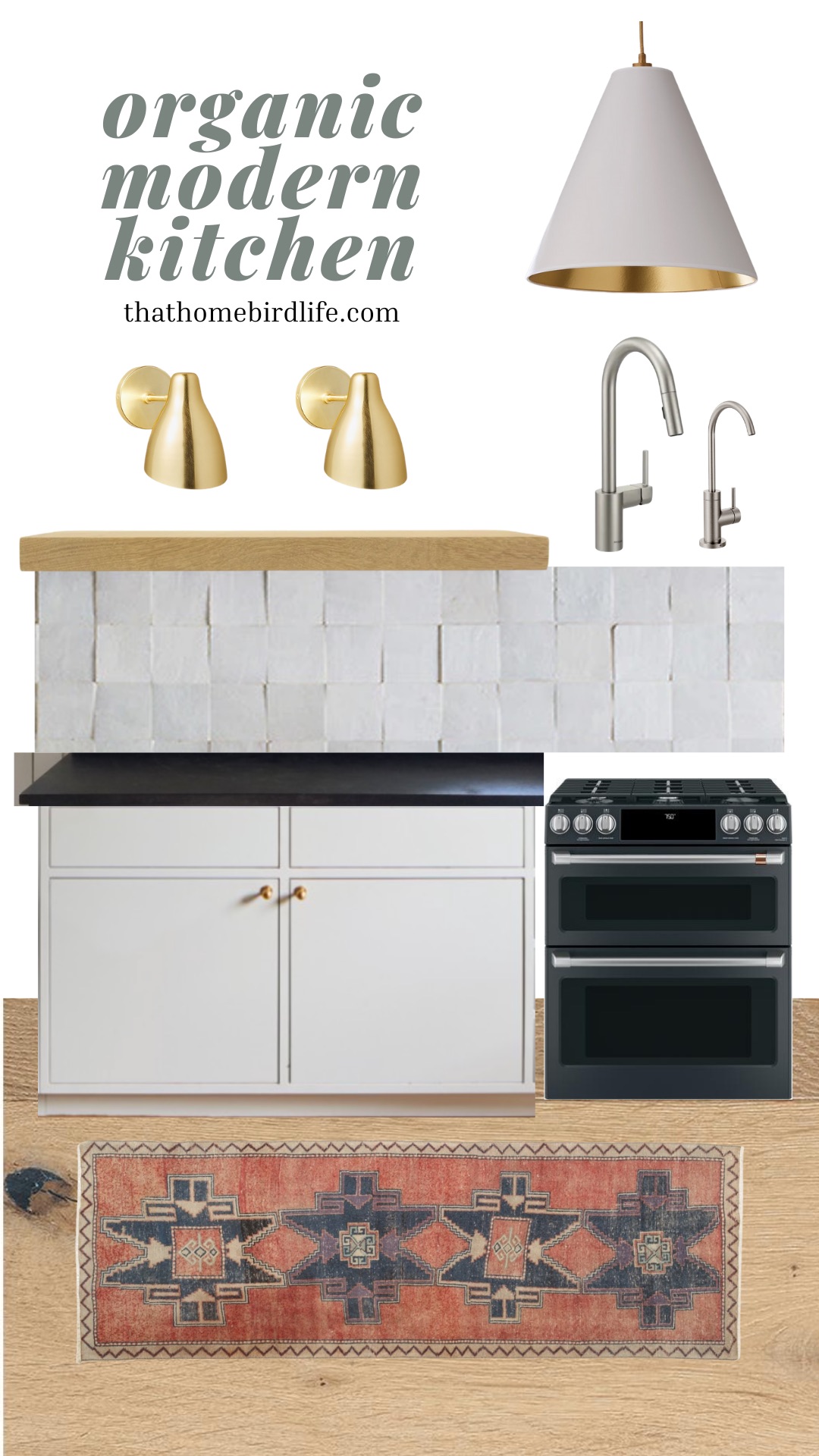
Our cabinets will be flat front (slab) which is another functional/aesthetic decision. Functional, because we will be able to wipe them down with one swipe of a cloth. Aesthetic, because this is one of the "modern" elements that will contrast nicely with the texture of the countertop and backsplash. I'm planning on simple unlacquered brass ball knobs for hardware which will patina nicely over time. It also looks incredible with our cabinet paint color of choice—BM Revere Pewter.
As of this moment, I'm planning on soapstone countertops (the island will have a waterfall edge) BUT I'm still doing my research. They aren't maintenance free and they do show wear and patina, so I'm just deciding if this is something that is a positive or a negative for me. Right now, soapstone countertops have won my heart. Another option is quartz that looks like soapstone. (This would be more budget-friendly plus quartz is zero maintenance.)
Above the counters, I'm going with a natural zellige 4x4 tile which has a TON of texture and character, contrasting with a minimalist white oak floating shelf. The vent hood cover will also have very simple clean lines—we will frame it out and just paint it the same color as the walls (SW Alabaster, in case you're wondering.)
And finally—metal finishes. I'll be mixing black, brass and stainless steel finishes in this space to create some depth and contrast. In fact, this palette will be continued throughout the rest of the house. I plan on choosing a black fridge and slide-in range by Café Appliances, and a stainless steel dishwasher. My reason for not going with all black appliances is that I don't want the dishwasher to "pop" on that wall—rather I want it to blend in with the lower cabinets.
The faucet is my husband's choice as he does the dishes and "doesn't want anything fancy." This was an easy concession to make. We are adding a soft water loop so we will also have a little baby faucet next to it for drinking water. The lighting (3 sconces and 2 island pendants) will be mainly brass which will tie in with the cabinet hardware.
The next phase will be visiting cabinet makers and doing more research on my countertop choice. Wish me luck...and if you have any experience with soapstone countertops then please tell me what you think of them—I'd love your insight!
Our kitchen plans have changed! Catch up here.
Want to be the first in the know? Sign up to my mailing list!
Catch up on our house build plans:
Exterior
Living Room
Main Bathroom
Dining Room
Mudroom
Guest Room/Den
Laundry Room
Kids' Bathroom
Guest Bathroom
